Brand identity · Illustration · App concept
FINN
A navigation app that turns ordinary travel into spontaneous adventures.
Read the full case study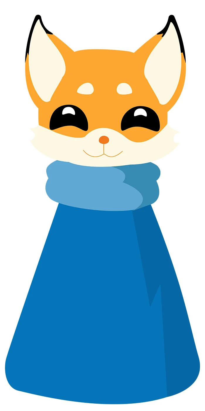
The problem
GPS apps prioritise speed and efficiency, reducing travel to predictable routines — people miss the detours and the surprises.
The idea
Flip navigation: instead of the fastest route, Finn curates unexpected, mood-based journeys. Getting lost becomes part of the fun.
The fastest routeThe most interesting routeTells you where you’re goingNot until you arriveCorrects a wrong turnCelebrates it
Key design decisions
01
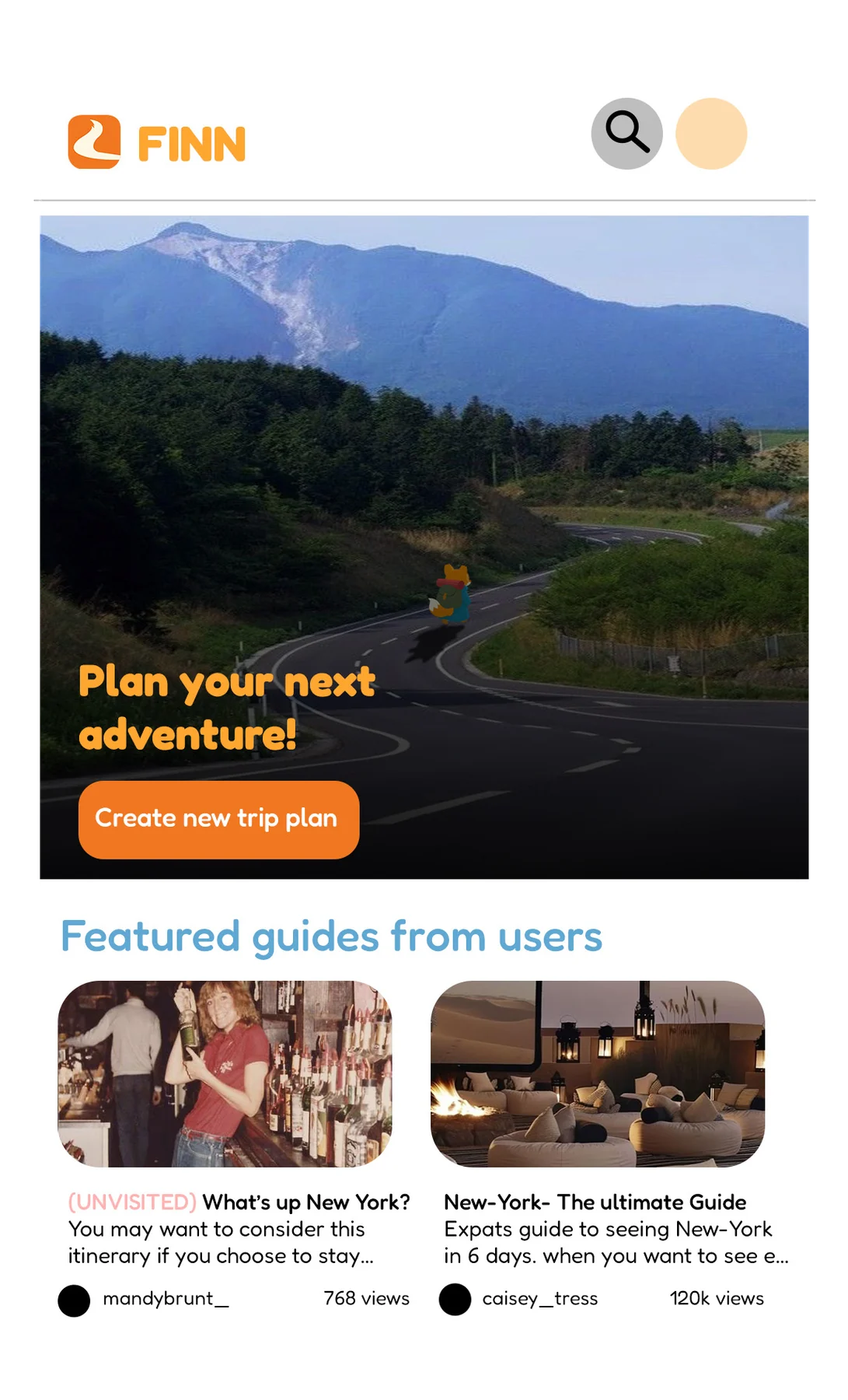
Choose a mood, not a destination.
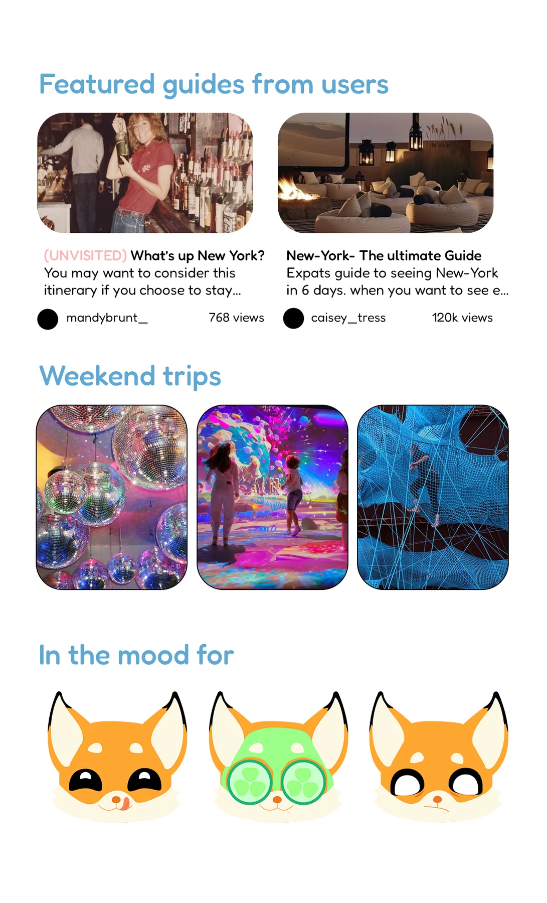
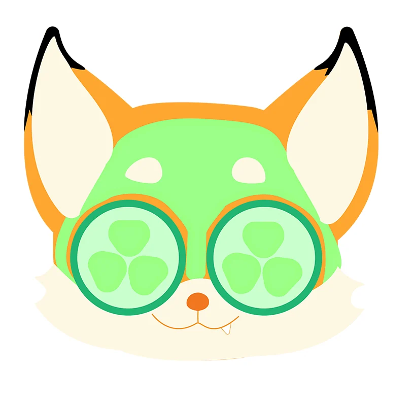
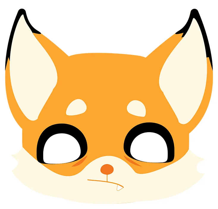
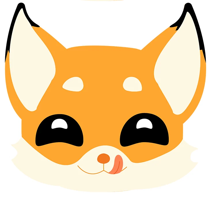
The fox’s expressions double as the app’s mood picker, so the character is how you navigate — not decoration on top of it.
02
A fox as the travel buddy.
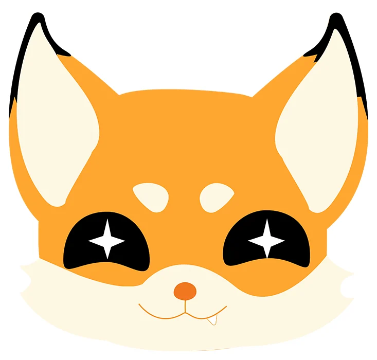
Finn embodies curiosity: a mischievous guide whose faces carry the tone — starry-eyed, relaxed, unsure, hungry for the next stop.
03
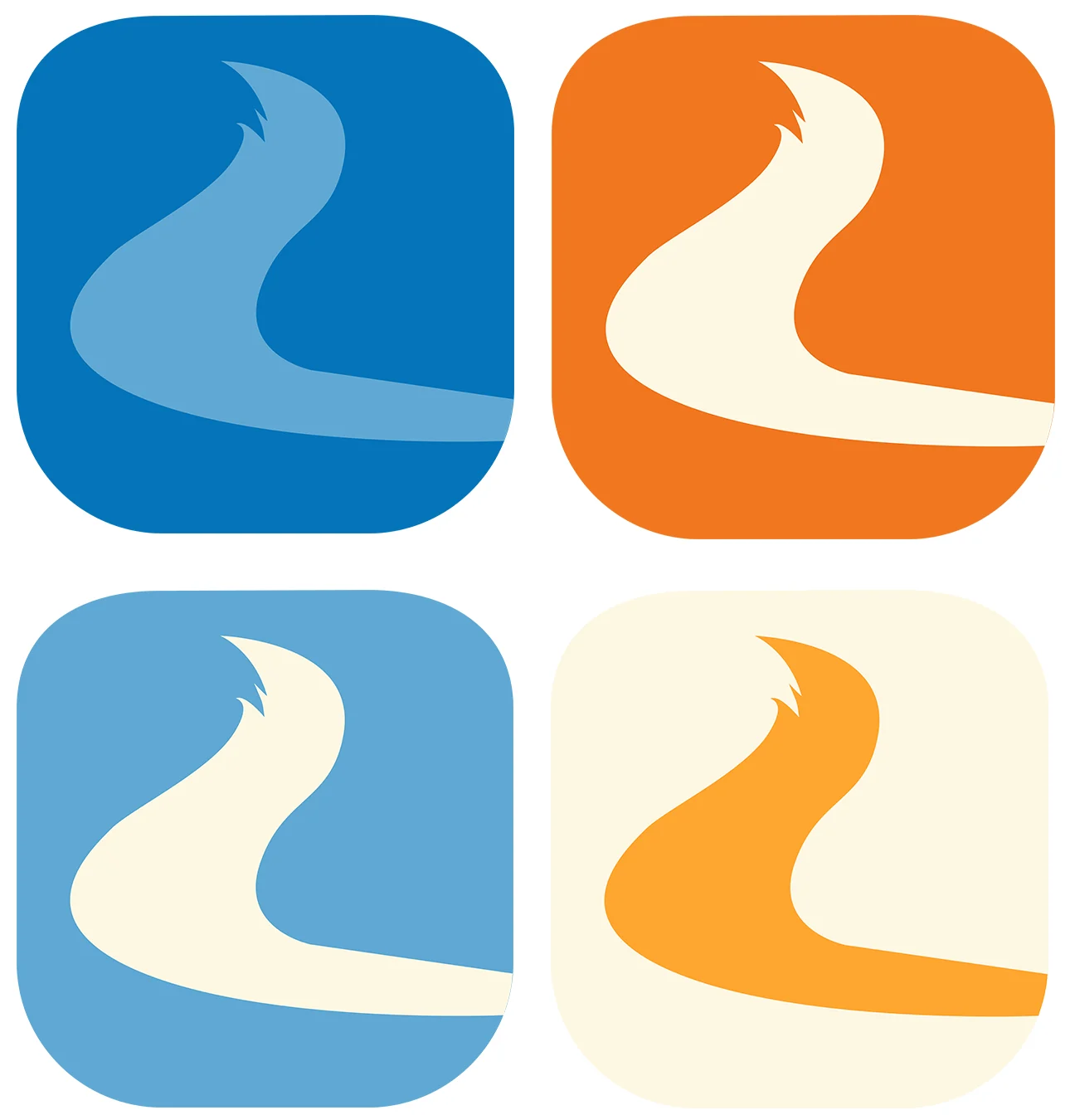
A logo that takes the scenic route.
A road that bends into a fox’s tail — the whole idea in one mark, repeated as four mood icons.
04
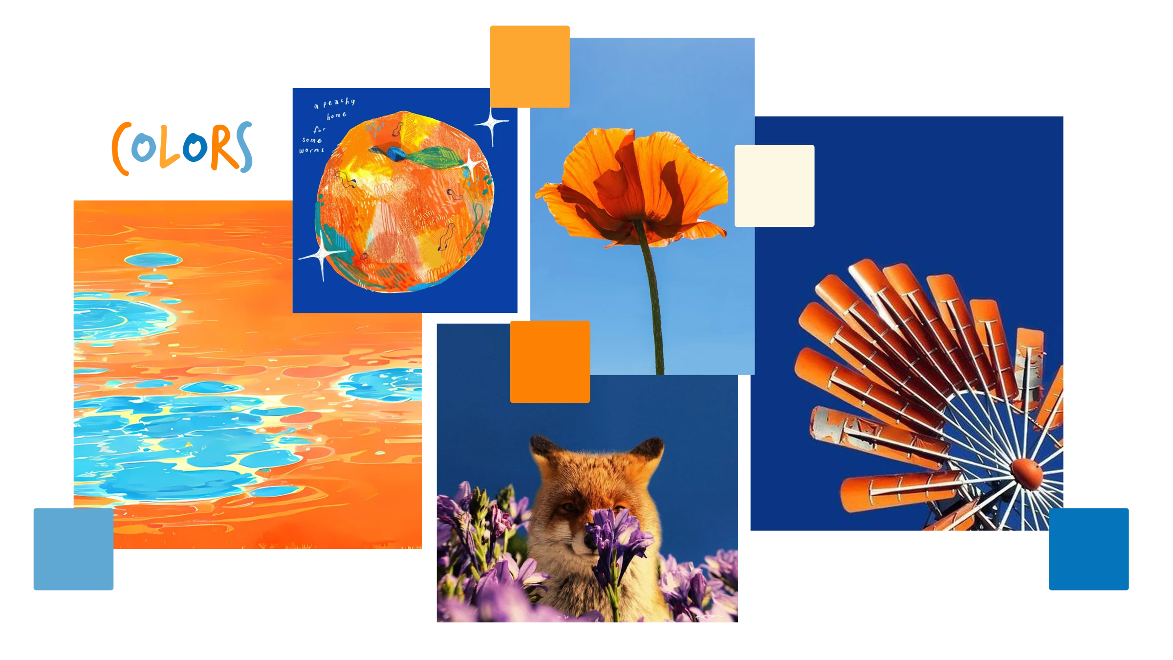
Clashing colour, collage and two voices of type.
Oranges against blues with scrapbook textures; a rounded face keeps navigation clear, a hand-lettered one adds spontaneity.
05
Out of home
Three billboards, one voice: a mischievous travel buddy daring you to take the scenic route.
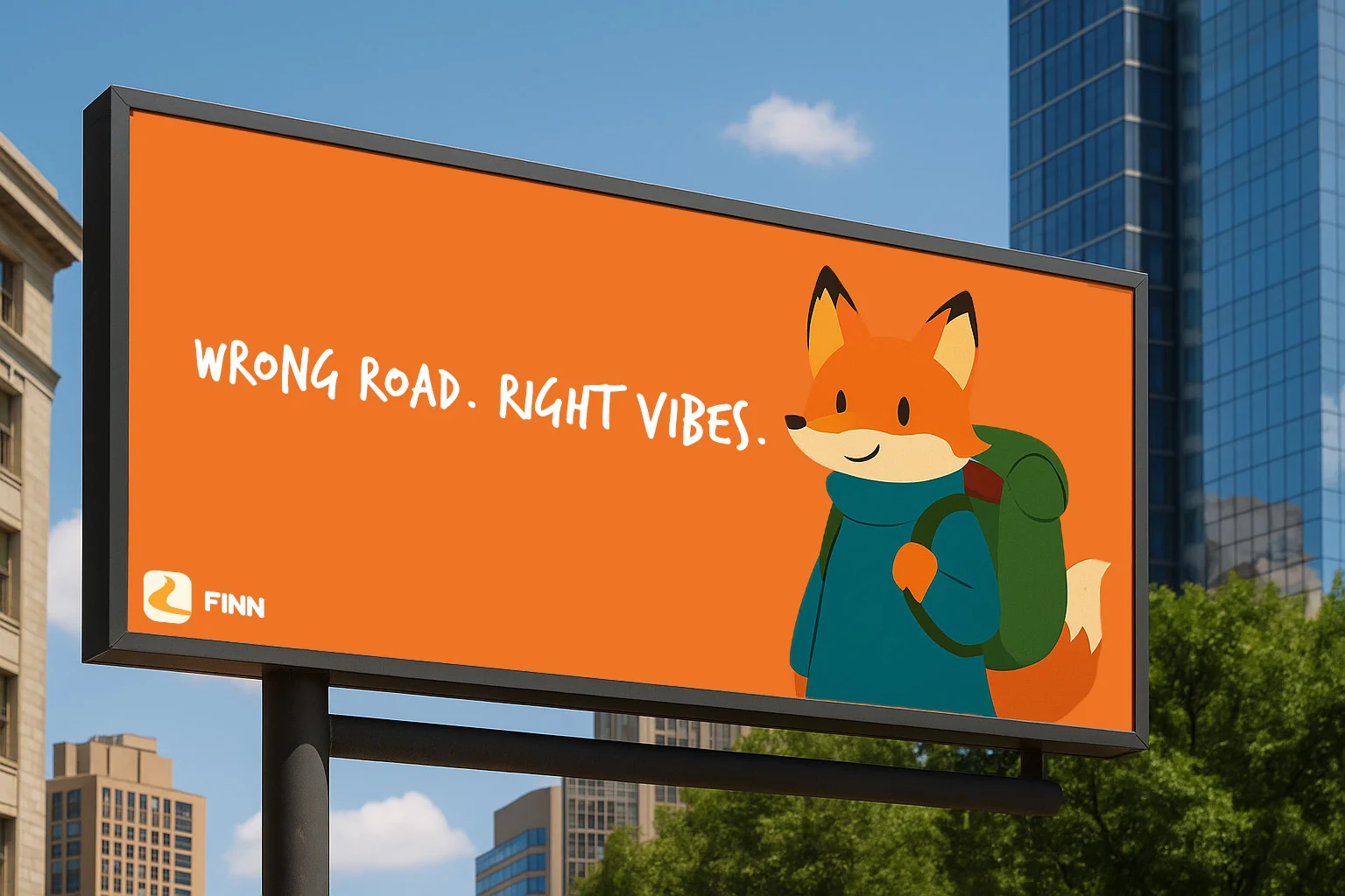
Billboard
“Wrong road. Right vibes.”
The campaign line in one image: the wrong turn reframed as the good part.
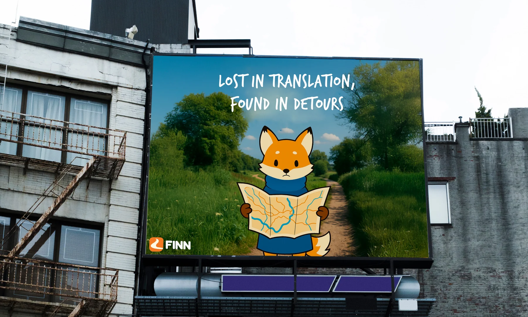
Billboard
“Lost in translation, found in detours”
Finn, map in hand: the detour as the discovery.
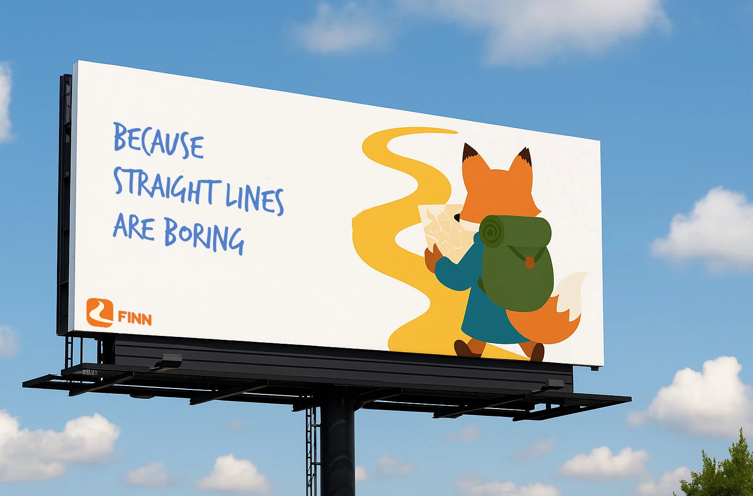
Billboard
“Because straight lines are boring”
Finn follows a winding yellow road across the board.
06
Social · @findwithfinn
User content first: four recurring formats built on real detours, mood routes and games.
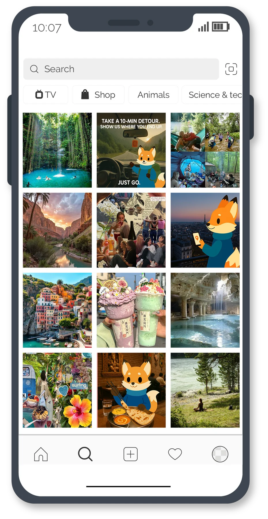
Instagram
The feed
“The world hides secrets. I know where they are. Follow clues, not maps.”
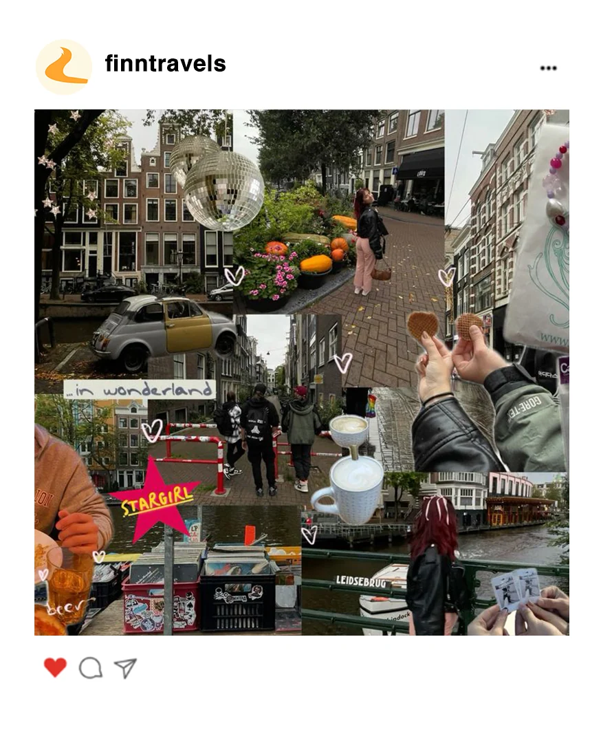
Format
Real people & their detours
Raw, user-submitted moments: “That wrong turn… was the whole point.”
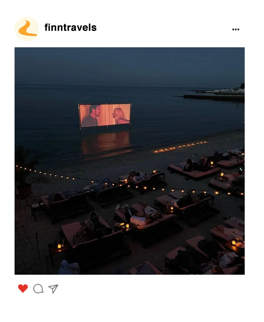
Format
Mood-based journeys
Carousels of mood routes: “POV: you asked Finn for a daydream walk.”
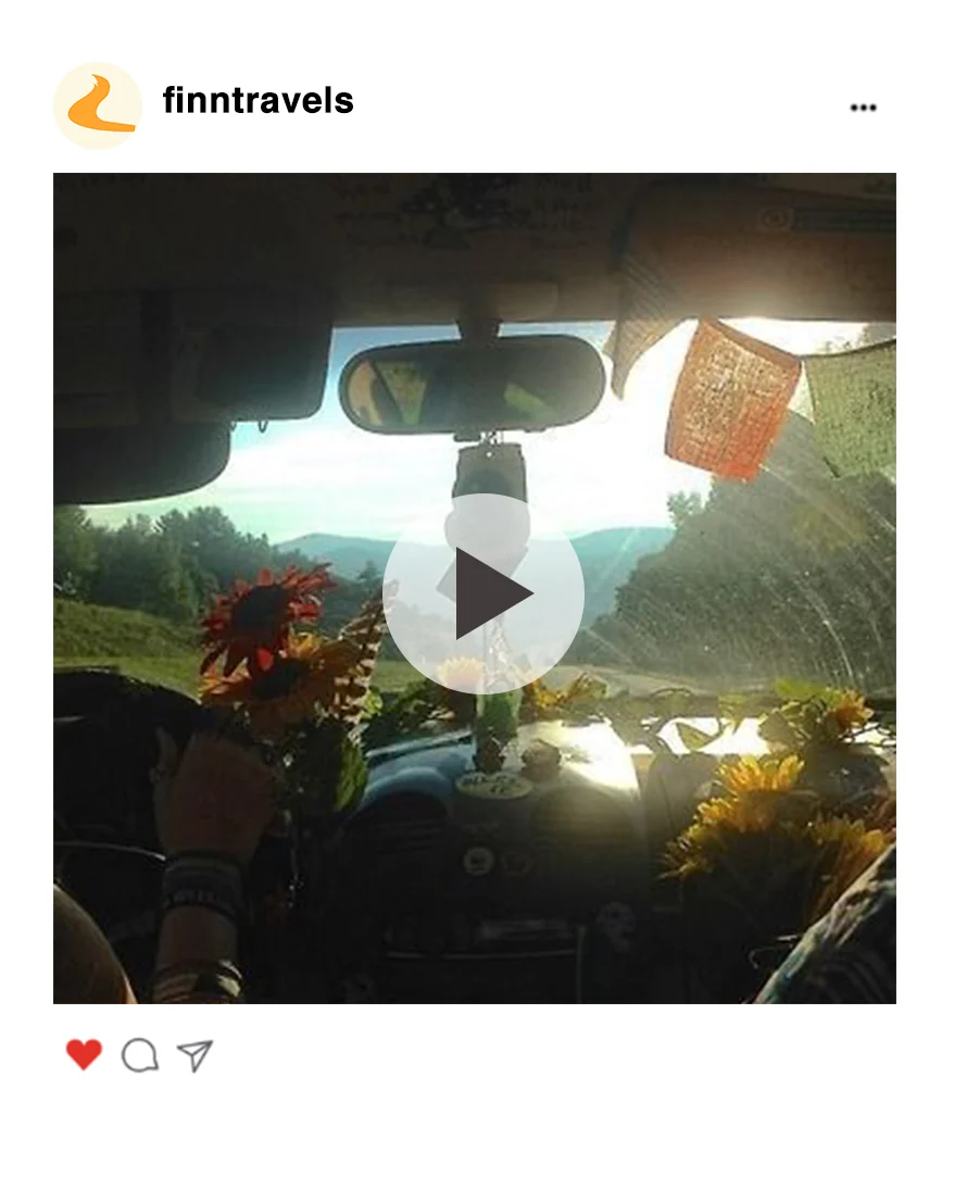
Format
Gamified engagement
Meme-style dares: “Take a 10-min detour. Show us where you land.”
Role and context
- Role
- Solo project — brand storytelling, personas, tone of voice, mascot and illustration, identity, app screens, billboards and social content
- Brief
- Unconventional Brand · Visual Communication, Istituto Marangoni
- Year
- 2025
The full case study has the story, the personas, the type system and every format.
Read the full case study