A navigation app that transforms ordinary travel into spontaneous adventures.
I developed the full brand concept, narrative, and visual direction for Finn, a navigation app that transforms ordinary travel into spontaneous adventures. My role covered brand storytelling, user personas, tone of voice, and the complete design identity including typography, colors, and visual style.
Role
Solo project — concept, illustration, design and editing
Identity, mascot, app screens, billboards, social content
Year
2025
The problem
Conventional GPS apps prioritize speed and efficiency, reducing travel to predictable routines.
Users often miss out on discovery, detours, and surprise experiences.
People often fall into routine, taking the same paths and missing out on new experiences. Mystery GPS encourages exploration, spontaneity, and adventure by turning every trip into a surprise. It brings back the joy of discovery in everyday travel.
Who it’s for
Weekend explorers seeking hidden spots
Couples looking for fun, random date nights
Road trippers without fixed plans
Creatives in search of inspiration
Fitness walkers and runners wanting variety
1A GPS gives you the fastest route
1GPS gives you the most interesting route.
2A GPS minimizes detours and distractions
2Encourages detours and unexpected discoveries.
3A GPS tells you exactly where you are going
3It doesn’t tell you where you’re going until you arrive.
4A GPS avoids unnecessary stops
4It suggests random fun stops along the way.
5A GPS follows a predictable, logical route
5It takes unpredictable, quirky routes
6A GPS corrects you if you take the wrong turn
6It celebrates wrong turns as part of the adventure.
7A GPS prioritizes efficiency over exploration
7It prioritizes curiosity and surprise over efficiency.
The solution
An exploration-focused navigation system that sends users on spontaneous adventures instead of predictable routes.
Finn flips the logic of navigation: instead of giving the fastest route, it curates unexpected, mood-based journeys.
Each trip is an adventure full of quirky detours, surprise stops, and hidden gems, turning “getting lost” into part of the fun.
How?
GPS selects unexpected destinations based on user preferences and real-time data. Users choose a theme, and the system picks a surprise location, offering scenic detours and local discoveries. It adapts to weather and time of day for a unique experience every time.
The app
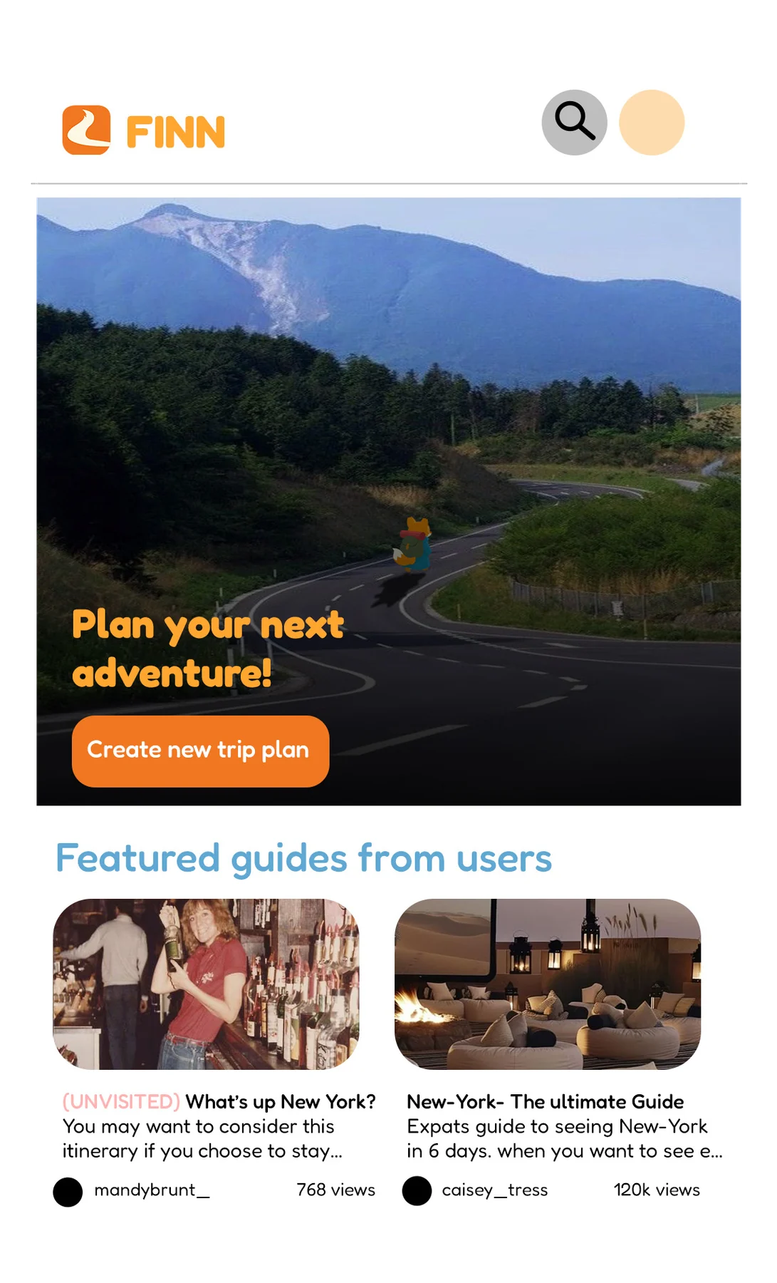
Plan your next adventure — then choose a mood, not a destination.
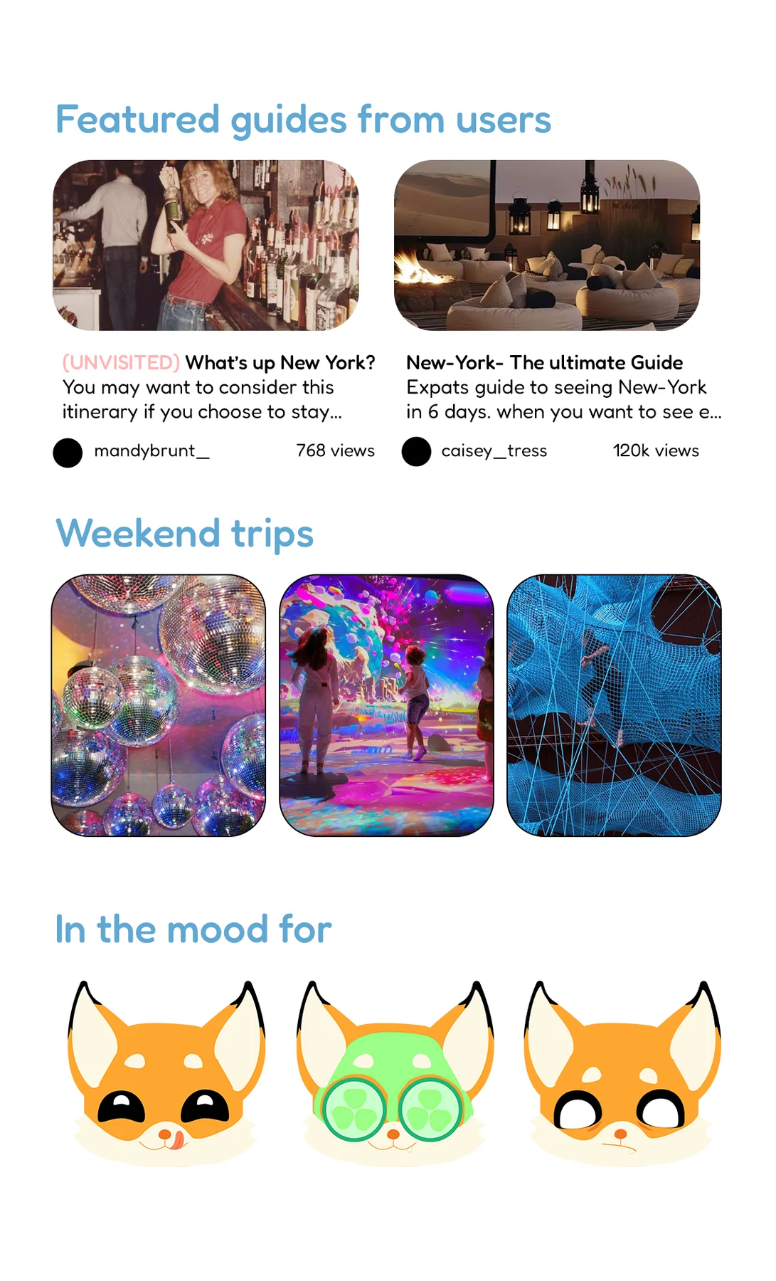
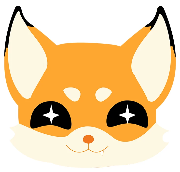
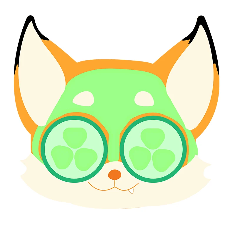
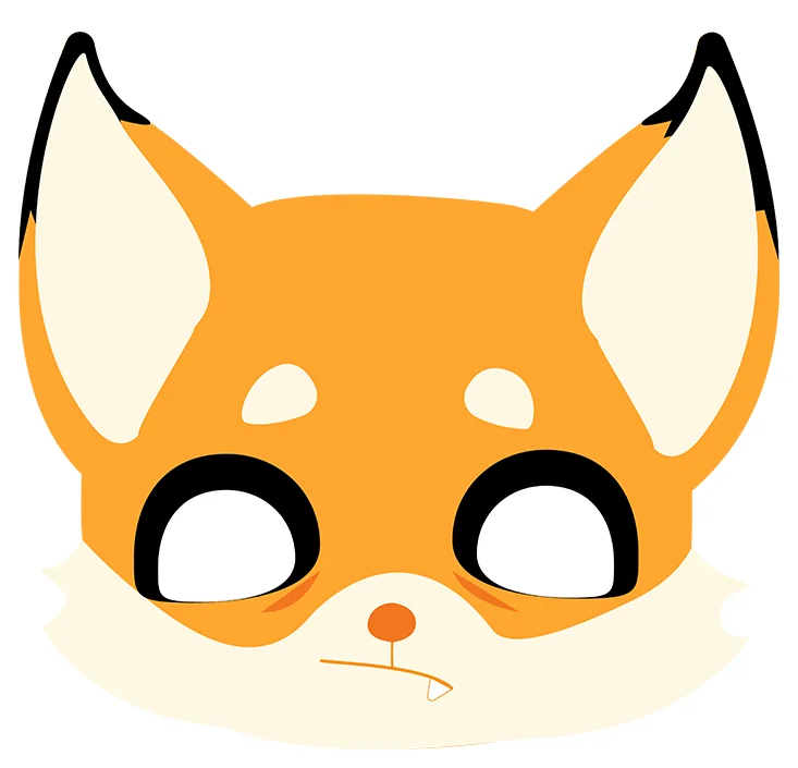
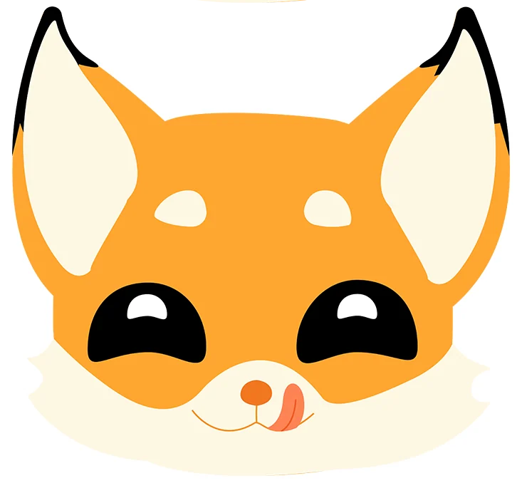
The fox’s expressions double as the app’s mood picker, so the character is part of how you navigate, not decoration on top of it.
The story
Because in the end, getting lost is just another way of being found.
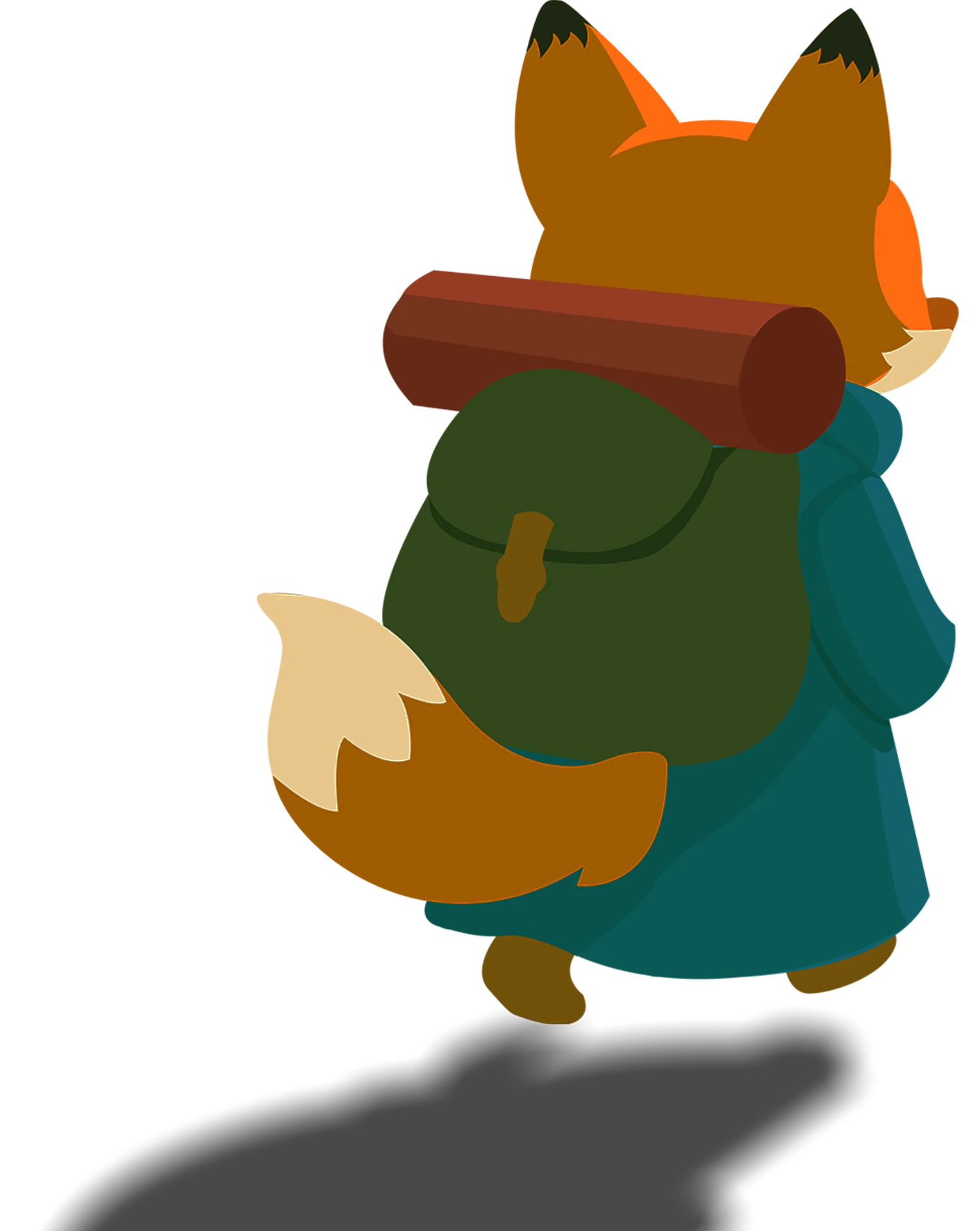
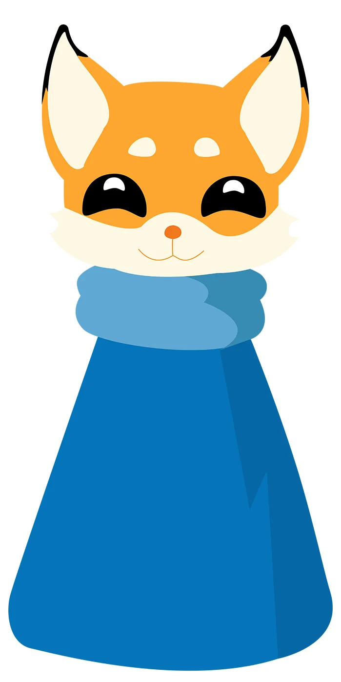
Finn the Fox represents the brand’s spirit of curiosity. Guided by a glowing, ever-changing map, he ventures into places like Firefly Grove and the Swirling Wind Maze, learning lessons of light, trust, and exploration. Just like Finn, the app encourages users to embrace detours and trust the journey.
The work
One fox, one palette, and a voice that dares you to take the scenic route.
Logo
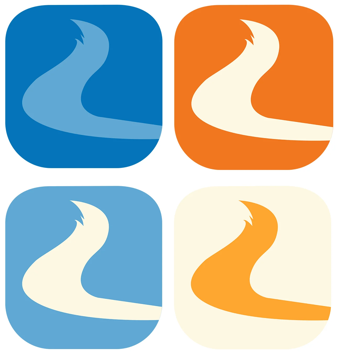
a road that bends into a fox’s tail
Icons
four moods
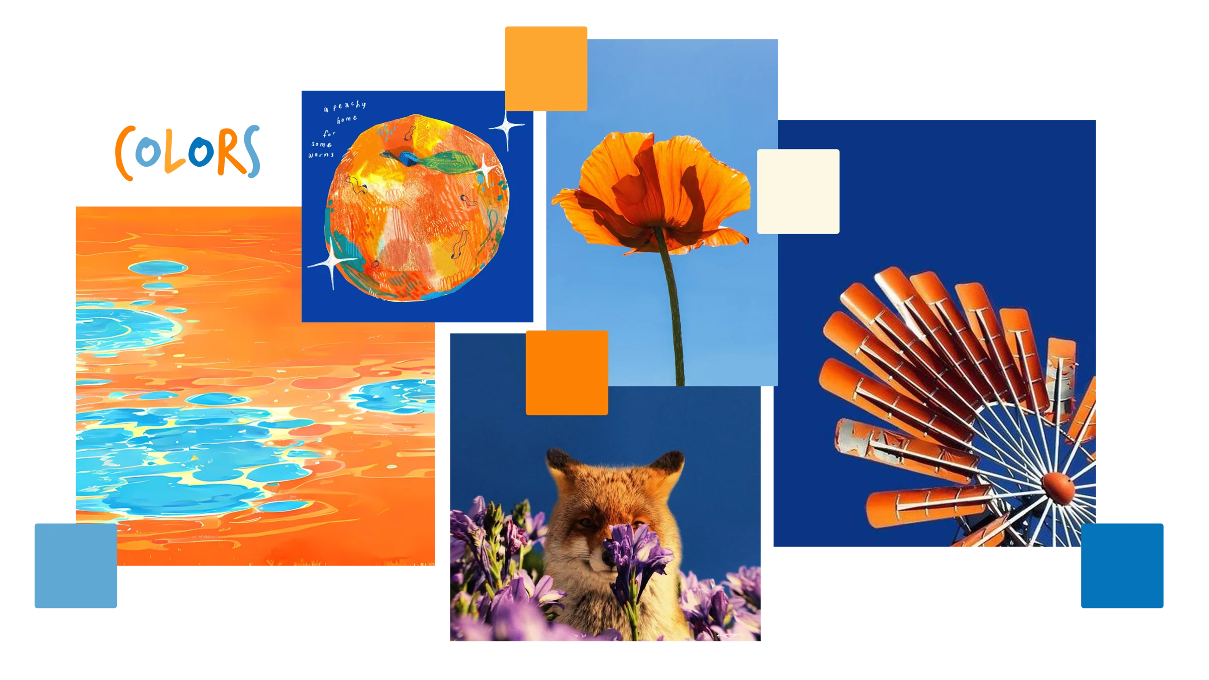
Vibrant clashing oranges and blues, paired with collage-style textures.
Fredoka
primary
Aa Gg
Aa Bb Cc Dd Ee Ff Gg Hh Ii Jj Kk Ll Mm Nn Oo Pp Qq Rr Ss Tt Uu Vv Ww Xx Yy Zz
TrashHand
secondary — headings & lettering
FINN
A B C D E F G H I J K L M N O P Q R S T U V W X Y Z 0 1 2 3 4 5 6 7 8 9
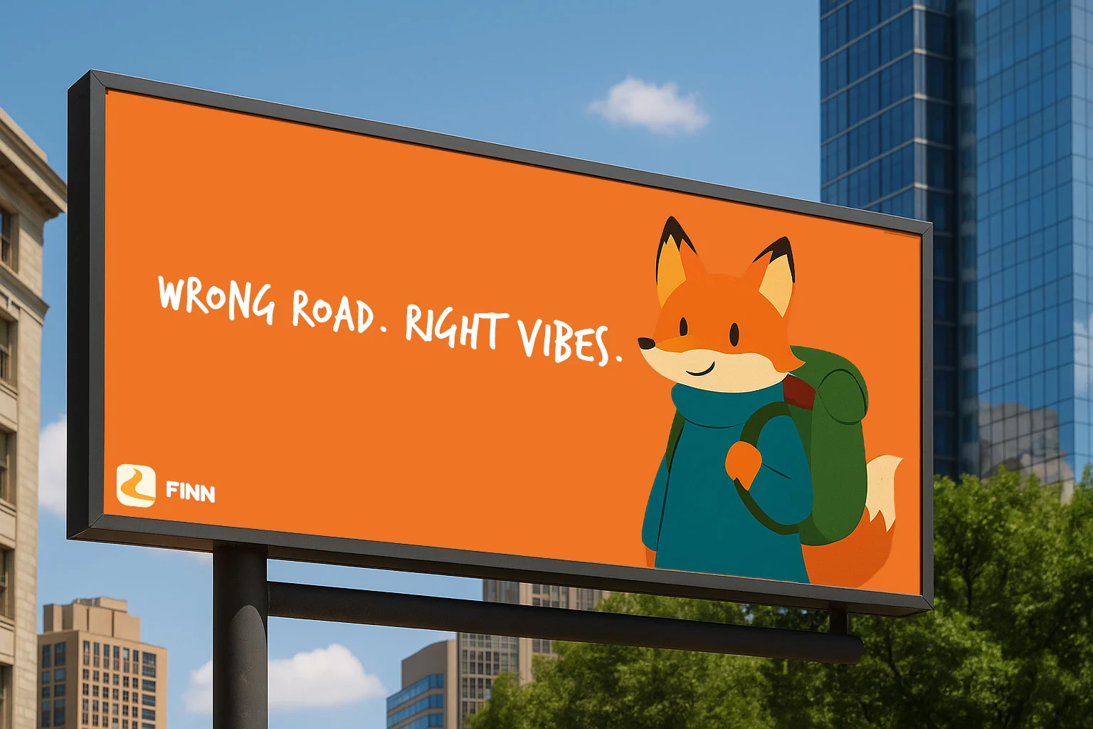
Wrong road. Right vibes.
Using Fredoka (PRIMARY) and TrashHand (SECONDARY) together gives the app a playful yet personal feel, Fredoka’s rounded, friendly shapes make navigation clear, approachable, and easy on the eyes, while TrashHand’s casual, handwritten style adds a sense of spontaneity and adventure, perfectly matching the app’s mix of cute guidance and unpredictable, exciting exploration.
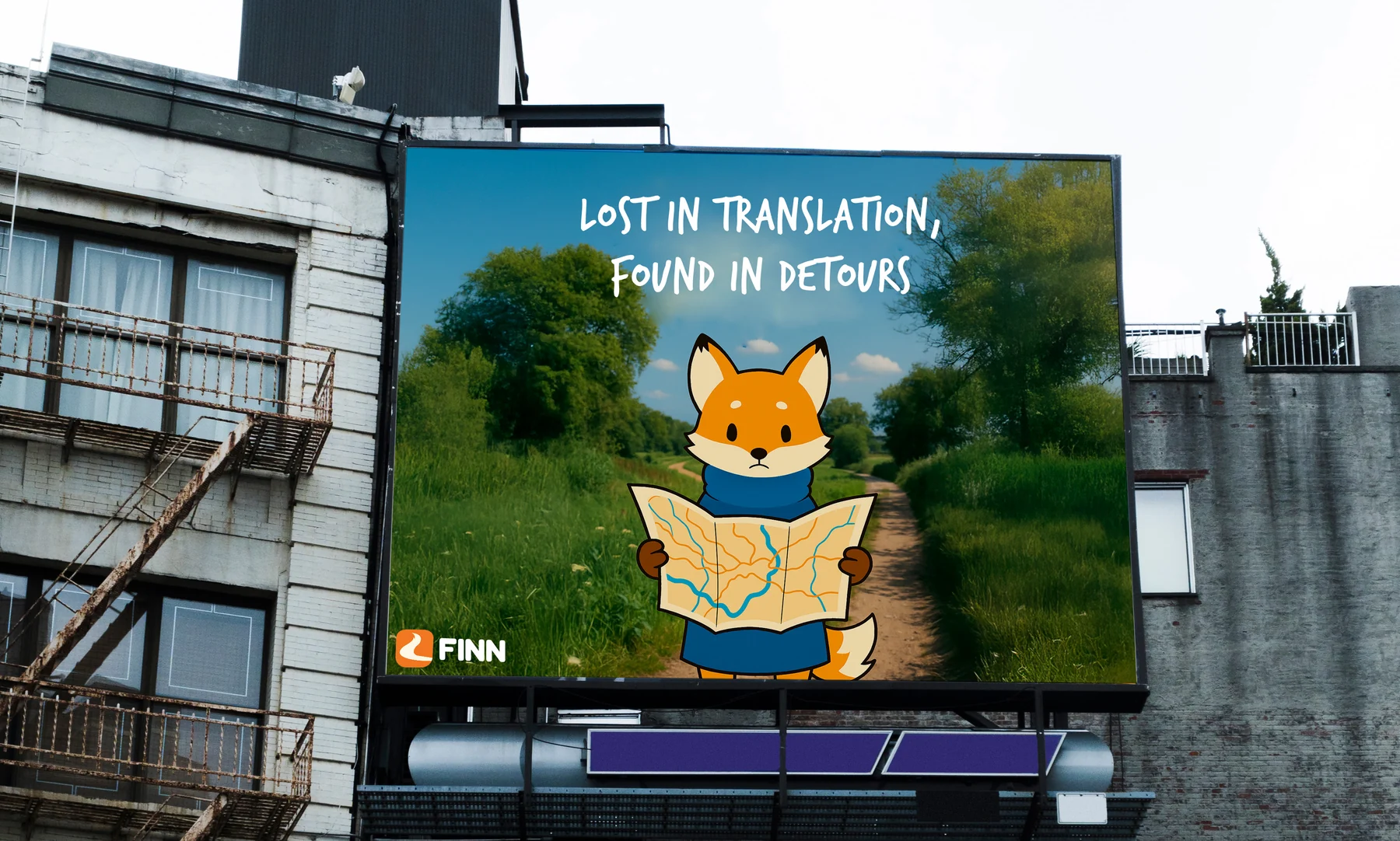
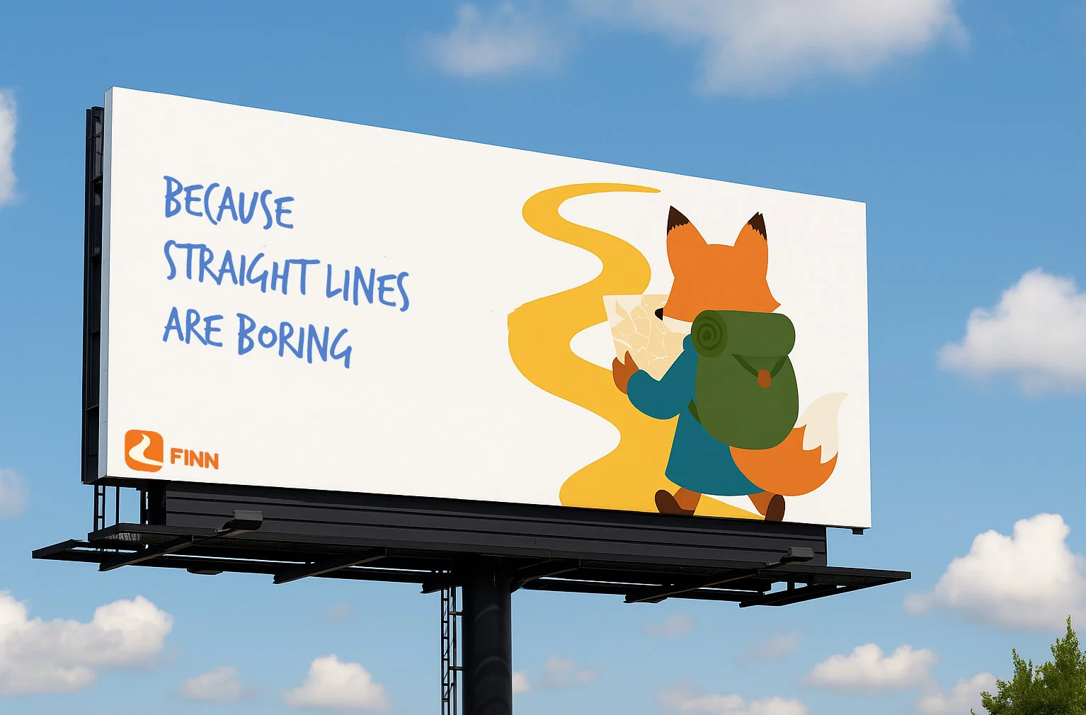
Out of home
Design direction
Collage & Scrapbook Feel
Imperfect, raw visuals, bold typography, grainy textures.
Humor & Irony
Wrong turns and detours reframed as joyful discoveries.
User Content First
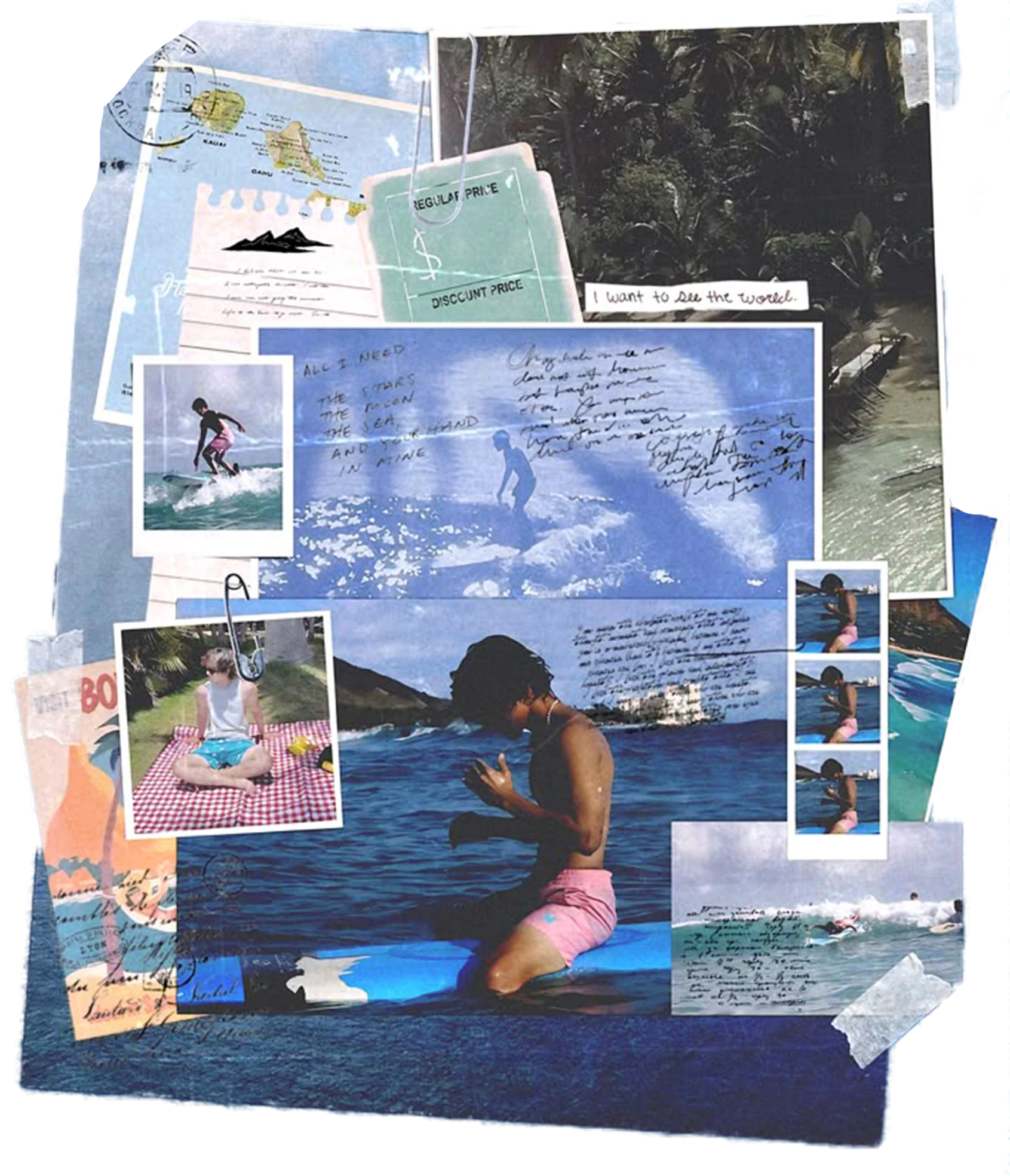
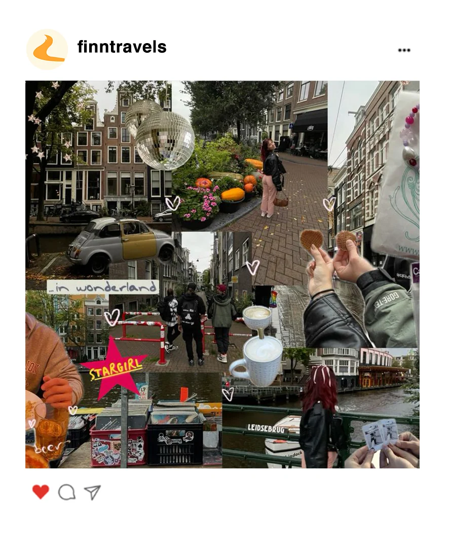
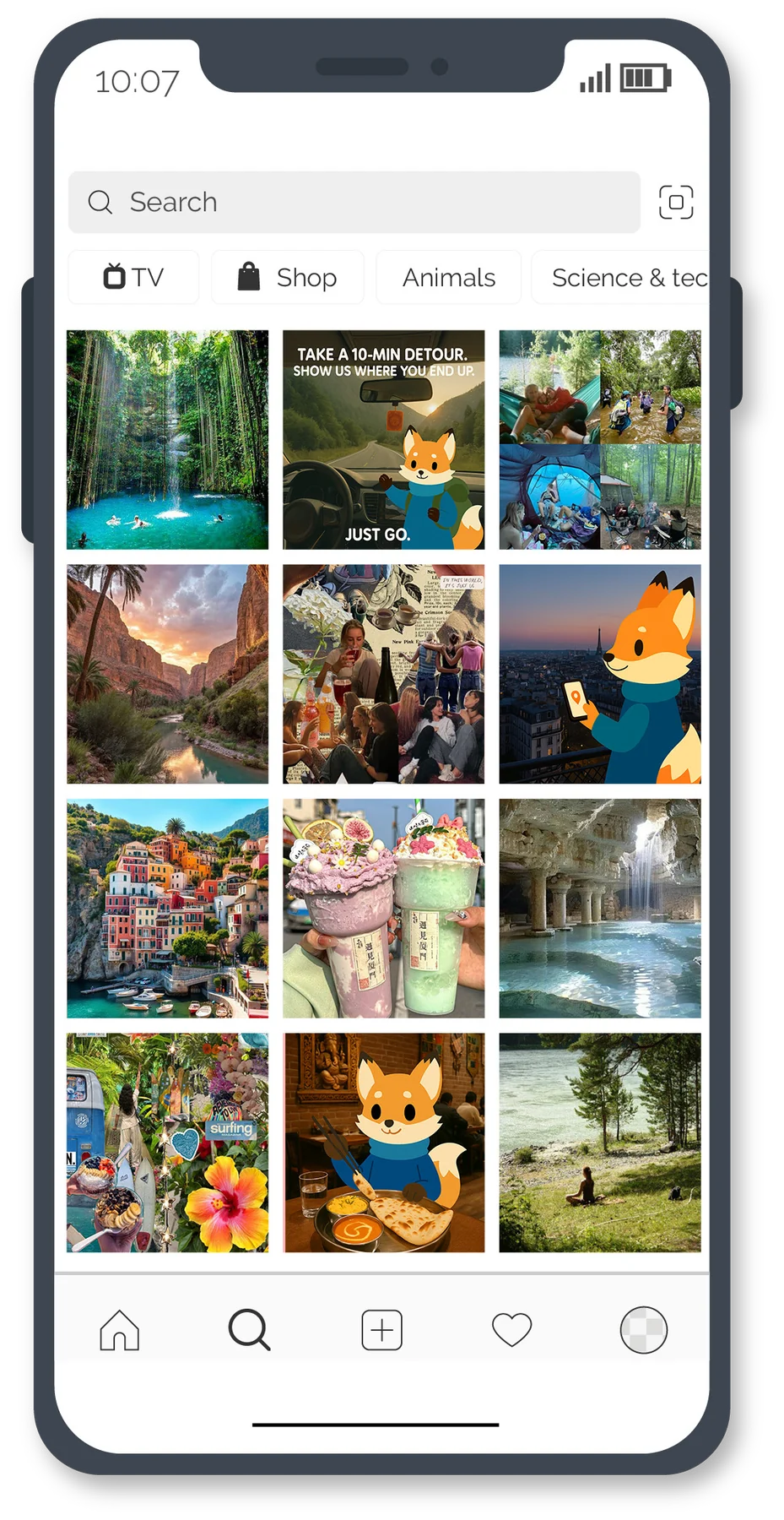
Community photos (blurry, accidental beauty, Polaroid-style) featured in recurring series like “Spotted on the Detour”.
Tone of voice
Playful explorercurious, witty, mischievous, a bit cryptic but always warm.
Inviting mysterynever reveals everything at once, leaves breadcrumbs.
Casual but clevershort sentences, conversational tone, emoji sprinkles.
Empowering curiosityencourages detours, mistakes, and discoveries.
Four recurring formats
unexpected travel gems
unexpected travel gems
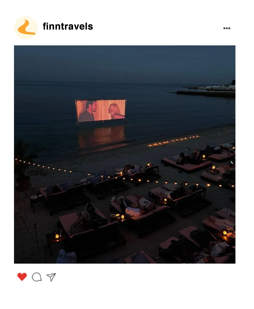
Posts with bizarre, hidden places with minimal context to make people curious.
“Google Maps won’t tell you about this… The quietest café in the city, hidden in an alley only locals whisper about.”
Real people & their detours
Raw, unfiltered travel moments with user-submitted photos.
“That wrong turn you thought ruined the day? Turns out it was the whole point. #WrongTurnsWereRight”
Mood-based journeys
Carousel posts showcasing different “mood routes”.
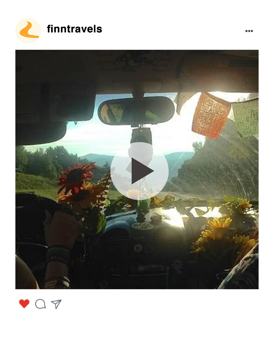
“POV: You asked Finn for a ‘daydream walk’ and ended up at a sunflower field”
Gamified engagement
Meme-style content (“When Google Maps says 10 mins, but your app takes you on a scenic 45-min ride”).
“Take a 10-min detour. Show us where you land. Don’t overthink. Just go.”
The feed · @findwithfinn
“The world hides secrets. I know where they are. Follow clues, not maps.”
Profile bio
Monthly specials:
Community Hunt — hashtag challenge.
Mood Guide — carousel exploring one vibe.
Lost & Found Series — user highlights.
At the end of the day, Finn isn’t about maps, destinations, or efficiency, it’s about reminding people that getting lost is part of the fun. The brand works because it doesn’t talk like an app, it talks like a mischievous travel buddy daring you to take the scenic route. Between the fox’s playful personality, the witty copy, and the mix of real-world imagery with illustration, everything comes together to feel approachable but different. It makes you curious, it makes you smile, and most importantly, it makes you want to try it. Because in a world obsessed with speed and straight lines, Finn’s detours feel like a breath of fresh air.