Neha Mirle

WebsiteProposed concept

Cappellini, in your space.

A playful, immersive, and product-centered platform.

The website from the proposal, recreated as a working front end: browse the collection, inspect real Cappellini 3D files, then try pieces in a photo of your own room.

GuidedWhat the campaign changed

From brand website to campaign website, one change at a time.

Scroll: each step shows the change in the mock-up, what changed, why, and how it carries “Stay Playful”.

  1. 00

    The starting point

    Same structure, new attitude

    Same structure, new attitude
    What stays
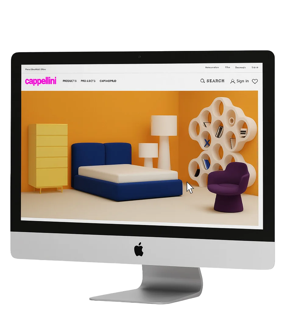
    The site’s architecture: the global bar (Rest of world | en, Newsletter, FAQ, Contacts, Stores), the four sections Products, Projects, Cap-World and Inspirations, search, sign-in and wishlist — all visible in the deck’s mock-up.
    Why
    The campaign changes how the site feels, not how it works: existing customers still find everything where they expect it.
    Campaign link
    “Stay Playful” lives inside the brand, not beside it.
  2. 01

    01 · The logo

    A logo that changes colour

    The Cappellini wordmark in magentaThe Cappellini wordmark in orange
    What changed
    Dynamic Logo: changes color for a playful touch. The mock-ups show the wordmark in magenta on the homepage and orange on the product grid.
    Why
    The brand’s most recognisable element becomes the first proof that it can play — every visit looks slightly different.
    Campaign link
    The colours come from the Art of Everyday paintings, so the logo borrows the campaign’s palette.
  3. 02

    02 · The homepage

    Campaign banners first

    Campaign banners first
    What changed
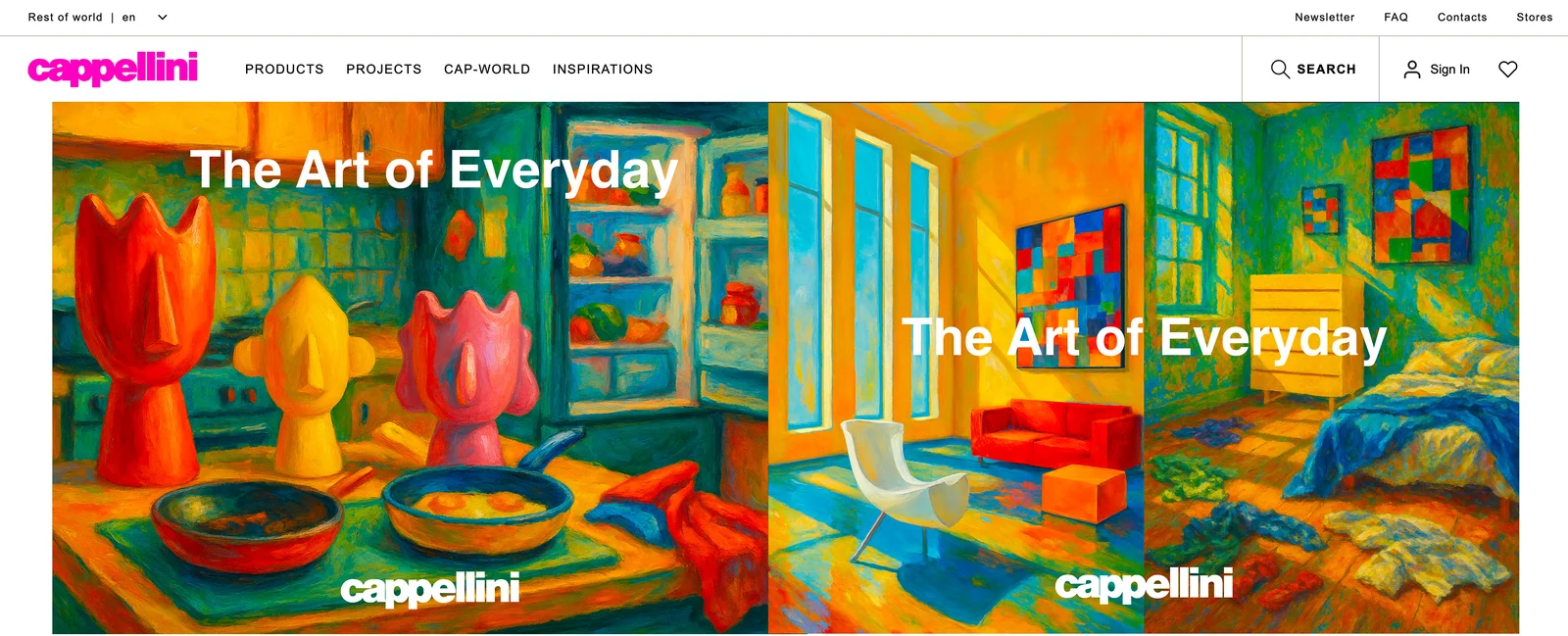
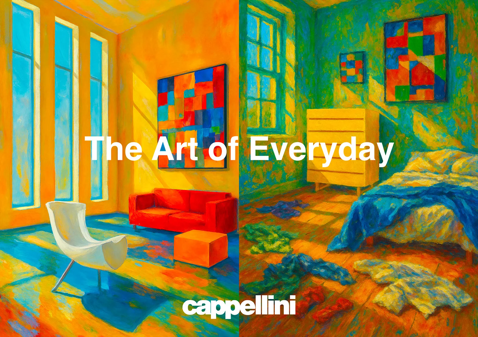
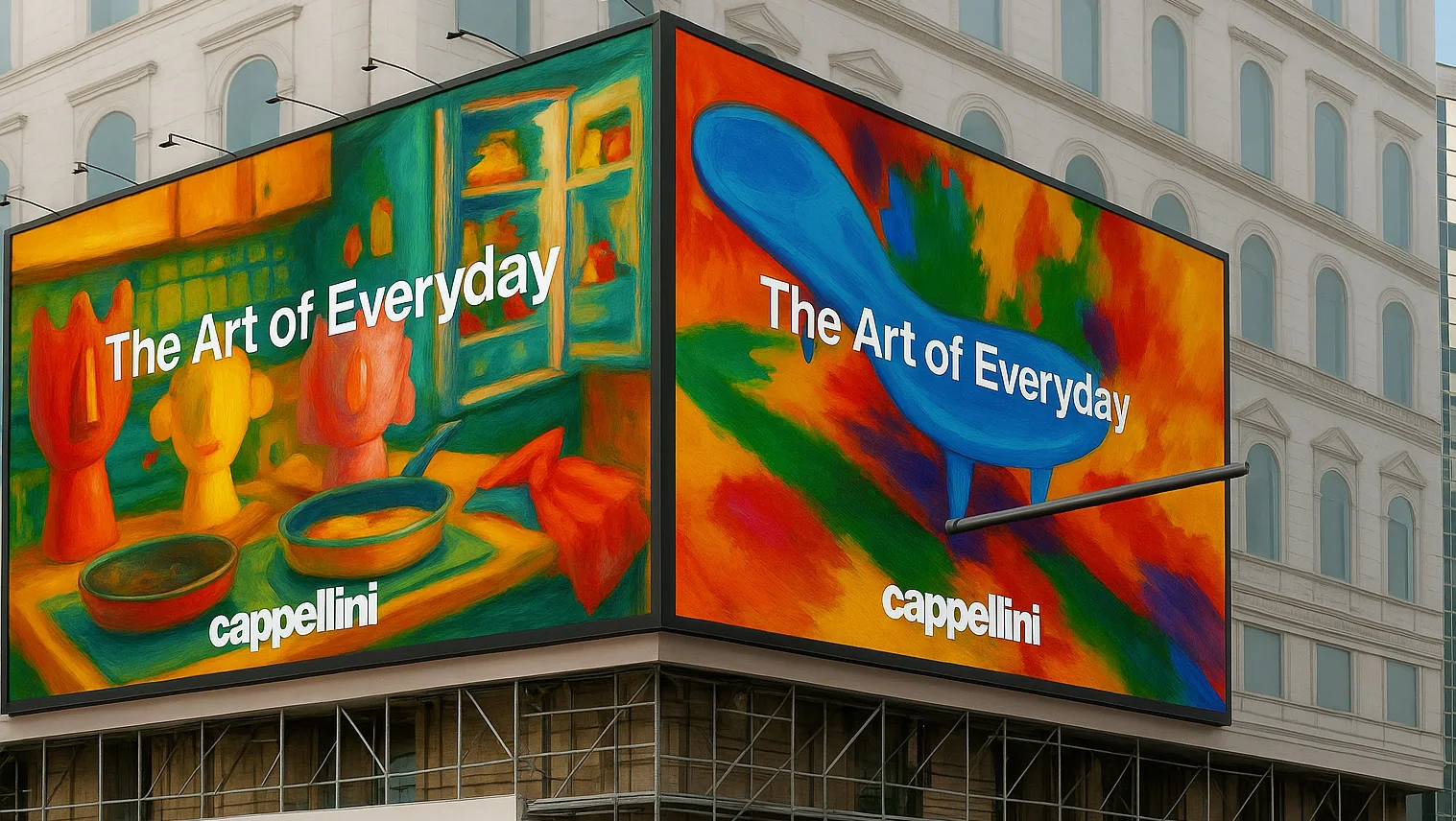
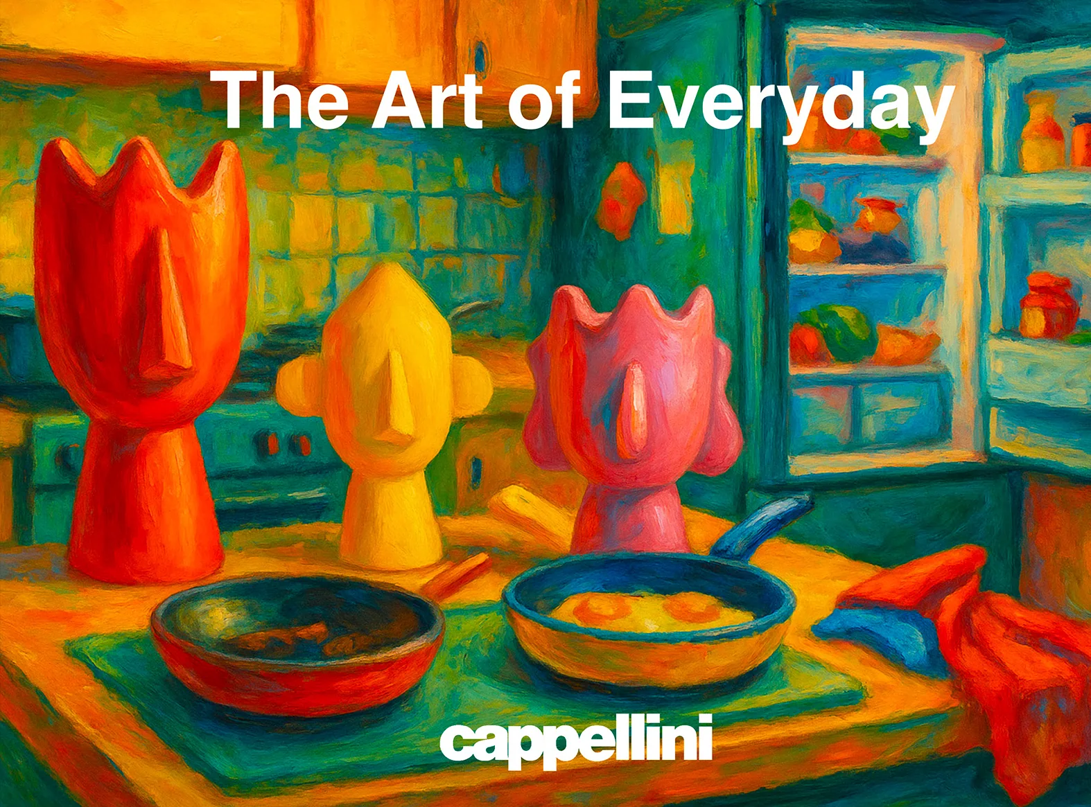
    Homepage: campaign images and activations. The hero becomes two Art of Everyday paintings, each signed with the wordmark.
    Why
    Visitors meet the campaign before the catalogue, exactly as they would on the street.
    Campaign link
    The same paintings as the billboards and posters: online and outdoor tell one story.
  4. 03

    03 · Featured products

    Products, right under the art

    Products, right under the art
    What changed
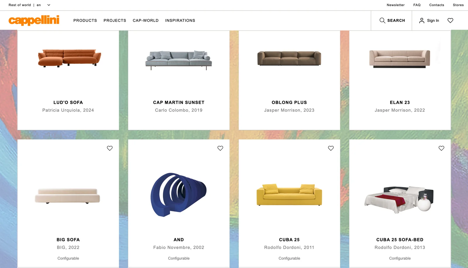
    A “Featured products” row follows the campaign banners on the homepage.
    Why
    “A playful, immersive, and product-centered platform”: the art opens the page, the products stay one scroll away.
    Campaign link
    Pieces seen painted in the banners can be found as real products a moment later.
  5. 04

    04 · Colour play

    Painted grounds behind white cards

    Painted grounds behind white cards
    What changed
    Color Play: vibrant accents without overshadowing products. The product grid sits on a painterly background while each product keeps a clean white card.
    Why
    The paint gives energy; the white cards keep the photography honest and comparable.
    Campaign link
    The site’s visual language becomes the campaign’s: strokes, texture, rich colour.
  6. 05

    05 · Storytelling

    A narrative across the site

    A narrative across the site
    What changed
    Storytelling: narrative woven throughout the site. In this prototype it appears as Cap-World stories for the launch, the artist playground and the VR experience.
    Why
    A movement needs a place to be told, beyond product pages.
    Campaign link
    Each story is a chapter of “Stay Playful”: launch, Design Week, the store.
  7. 06

    06 · In your space

    Try the pieces at home

    Try the pieces at home
    What changed
    In the new section of the Cappellini website, users will be able to upload a real image of their home and experiment by placing our furniture within that space.
    Why
    This interactive tool will allow them to visualize how the pieces would look in their own environment before making a purchase decision, offering a personalized, practical, and creative experience.
    Campaign link
    Everyone gets to be the artist of their own everyday room.
  8. 07

    07 · Capjoy, on the site

    The playground, one click away

    The playground, one click away
    What changed
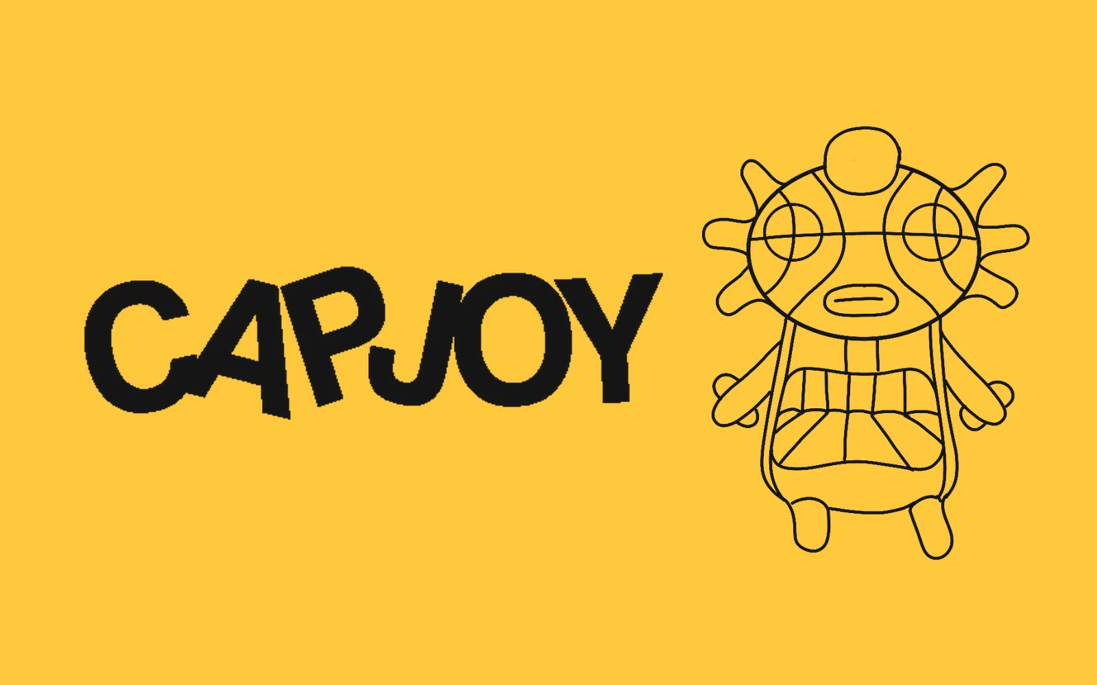
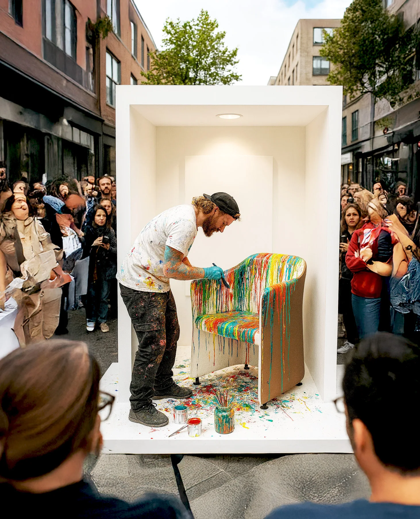
    A Cap-World entry for the Capjoy installations, linking the site to the Design Week playground.
    Why
    In this prototype the website is the hub that connects every deliverable.
    Campaign link
    The parks and the website point to each other.

LiveThe concept website

Now try it.

The redesigned site as a working prototype: browse, inspect the real 3D files, and place pieces in your own room.

Proposed website concept for “Stay Playful” · not the official Cappellini website · no shop
Rest of world | enStay Playful
Painted kitchen with three sculptural vases, titled The Art of EverydayPainted bedroom and living room with a white chair and red sofa, titled The Art of Everyday

Featured products

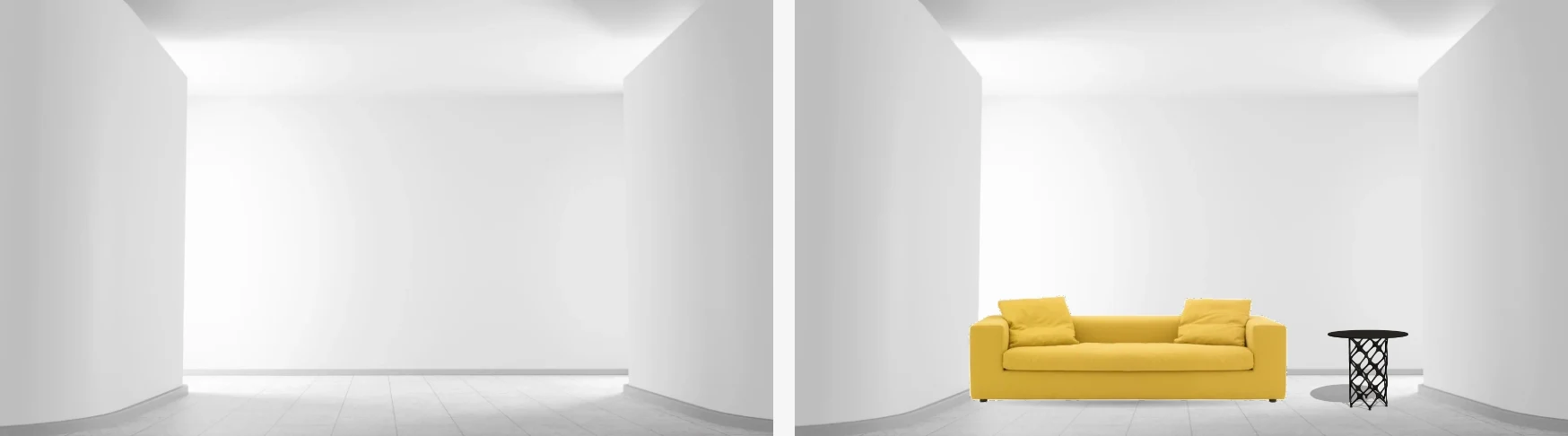
The same white room twice: empty, then furnished with Cappellini pieces placed with the In your space tool
New

In your space

In the new section of the Cappellini website, users will be able to upload a real image of their home and experiment by placing our furniture within that space.

The image shows the deck’s mock-up; the working tool below places Cappellini’s real 3D files at life size.

Stay Playful · concept website · 2026 portfolio prototype

NotesHow it was built

From the deck, and from Cappellini’s own files.

The homepage, product grid and room tool follow the deck’s website pages: campaign images and activations on the homepage, a dynamic logo that changes colour, colour play that never overshadows the products, and storytelling throughout.

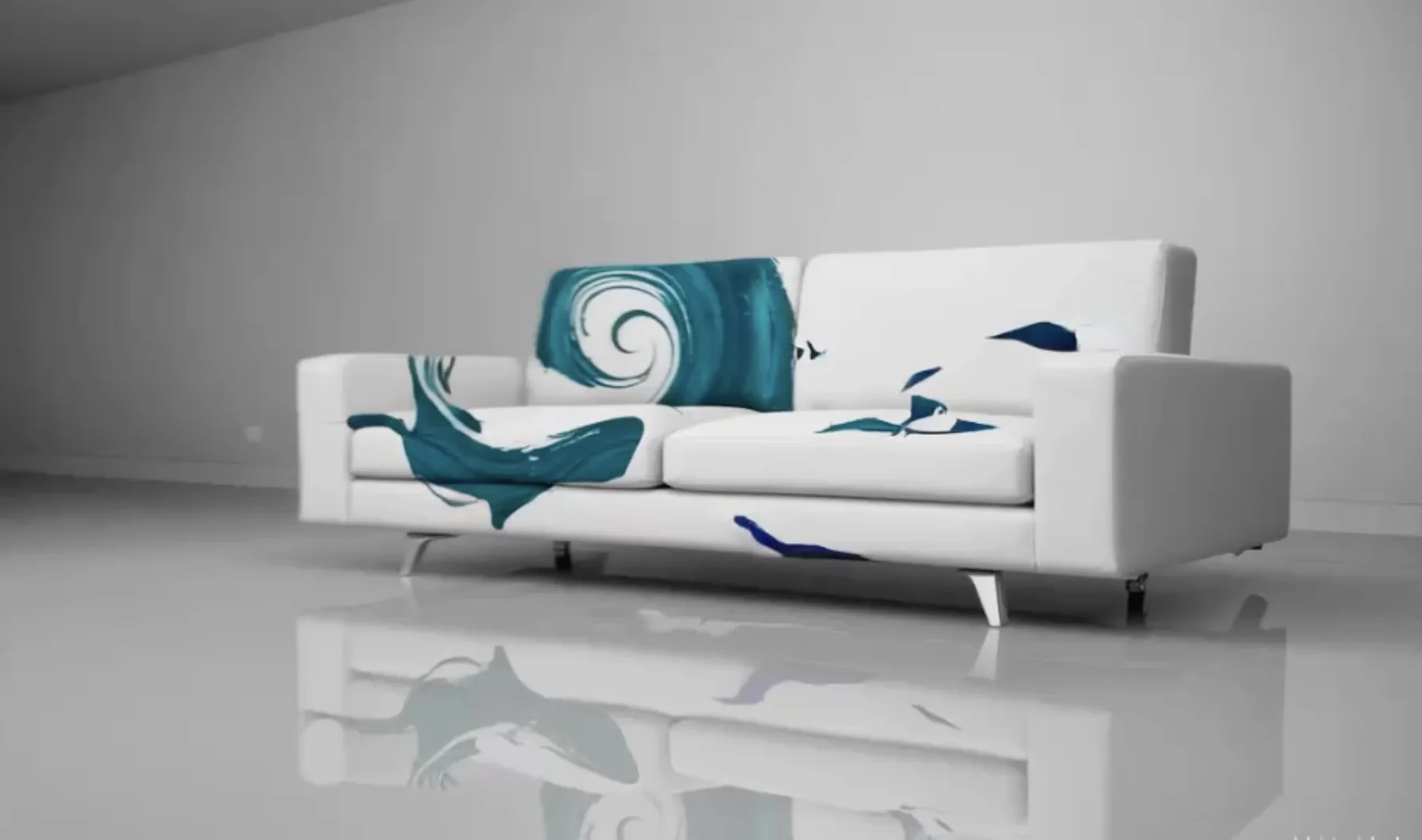
“In your space” uses only Cappellini’s own 3D files — five Three Sofa de Luxe elements, the Proust armchair and the X Table System in three heights. Each is converted from the file’s own units, so a 2-metre sofa stays 2 metres: the camera, not a size slider, relates the furniture to the room. On supported phones the same files open in AR.

A single photo carries no measurements, so true size relies on the camera settings under “Match your photo”. Preview colours on the sofa are illustrative. Nothing is uploaded or sold.