Neha Mirle

Master’s thesis · Digital Art Direction · Istituto Marangoni · 2026

The Illusion of Choice

Are we making our own choices — or are they shaped before we even realise it?

Visual storytelling in contemporary digital advertising

01The question · conscious choice

Persuasion through emotion is as old as Aristotle’s pathos. What is new is the environment: algorithms and AI now decide which emotional messages reach each person, when, and how often. The thesis asks what that does to perception — and to the feeling of having chosen.

  1. How does emotional visual storytelling affect perception and decision-making in digital advertising?
  2. How far can AI and recommender systems amplify emotionally persuasive design?
  3. How do emotional campaigns affect people’s sense of their own autonomy?
  4. How can designers and brands persuade emotionally, ethically, and still be effective?
PathosVisual rhetoricLifestyle brandingAlgorithms & AI

Method: a literature review, case studies of digital platforms and campaigns, and a quasi-experiment with 36 participants.

02The psychology · beneath awareness

Most models treat emotion as a distortion of reason. The research the thesis draws on suggests the reverse: emotion, familiarity, story and ease frequently decide before deliberate reasoning arrives. Each mechanism below is described — and, where it can be, done to you.

01

The affect heuristic

People judge risks and benefits by their emotional impression — often before any rational assessment begins. Damasio’s patients who could not process emotion struggled to make even simple decisions: emotion isn’t interference, it is where judgement starts.

Slovic et al. (2002); Damasio (1995)

02

Narrative transportation

Fully absorbed in a story, we scrutinise its claims less; fact and fiction matter less than the experience. Gilbert adds that we provisionally accept what we understand and only question it later — if at all.

Narrative transportation; Elaboration Likelihood Model; Gilbert

She almost missed the train. Then someone saved her a seat, and the whole city felt warmer —

03

Mere exposure & illusory truth

Repetition makes things familiar, and familiar things feel preferable — and truer, even when people know better. Personalised feeds turn this into a loop: the same themes, again and again.

Zajonc (1968); the illusory truth effect; Pariser

04

Processing fluency

Information that is easy to process is judged more credible, whether or not it is accurate — and people don’t notice. The same clarity that makes design usable can make it persuasive.

Schwarz et al. (2021)

Emotional ads are remembered better.

Emotional ads are remembered better.

Same sentence. One feels more credible. (This one is a demonstration, not a finding — the thesis found the opposite for recall.)

05

Affective conditioning

Pair a neutral product with something that moves you, often enough, and the feeling transfers. People can come to prefer something without knowing why.

Affective conditioning; Zajonc

Tap to pair them. The circle has not changed — only what it sits next to.

06

Choice architecture

Defaults, framing and sequencing shape what is chosen, usually without awareness. More options don’t mean more freedom; algorithms go further, filtering options to what the system predicts you will engage with.

Choice architecture; Chernev et al. (2015); Zuboff (2019)

Pick one.

03The research · systems of influence

Facebook · emotional contagion

Emotional persuasion can work through the overall emotional environment an algorithm builds for each person — not one message, but the whole feed.

Kramer et al. (2014)

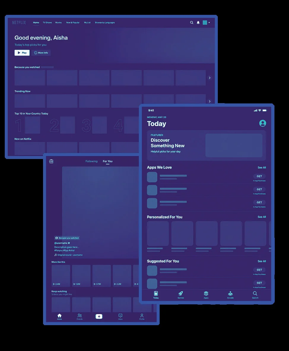
Netflix · personalised artwork

The same film is shown with different cover art to different viewers — a love story to one, an action film to another. The content is unchanged; the expectation is not.

Nam et al. (2026)

TikTok · For You

A feed that learns, then repeats themes, aesthetics and narratives — responding to preferences while also producing the next ones.

Baumann et al. (2026); Metzler & Garcia (2024)

  1. You
  2. Data
  3. Algorithm
  4. Curated content
  5. Emotional response
  6. Engagement

The system decides what reaches you.

An interface of personalised recommendation screens, from the thesis
FIG. 8 · algorithmic filtering

Algorithmic filtering narrows the options while keeping the feeling of choosing freely. What looks like a personal decision may be the most likely outcome of a system built to make it more likely.

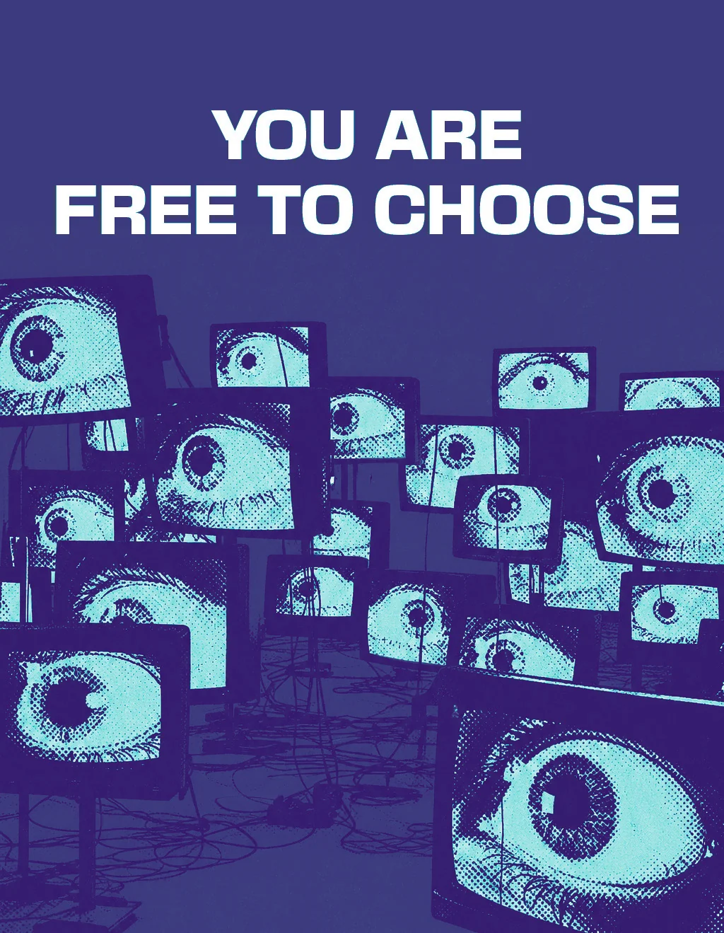
How a message is shown can matter more than what it says. The thesis illustrates it with one line — you are free to choose — in three visual treatments: the words stay identical; the meaning doesn’t.

“You are free to choose” over rows of watching eyes
FIG. 10 · version A
“You are free to choose” beside a calm white spiral staircase
FIG. 10 · version B
“You are free to choose” in script over a dreamy sky and sea
FIG. 10 · version C
EmpathyNostalgiaFamiliarityRelatability
  1. Visibility is controlled. You only see what the system judged relevant to you.
  2. Emotion is triggered. Empathy, familiarity and relatability prompt reaction before reflection.
  3. Repetition builds belief. Familiar starts to feel valid.
  4. Presentation steers interpretation. The same content reads differently depending on how it is shown.
  5. Choice is narrowed. It feels personal and free — inside an environment defined by prediction.

People remember how an ad made them feel — the music, the scene — and often not what it was selling.

04The experiment · testing the feeling

Objective
See whether emotional intensity — not information — changes preference, trust, understanding and speed of response.
Design
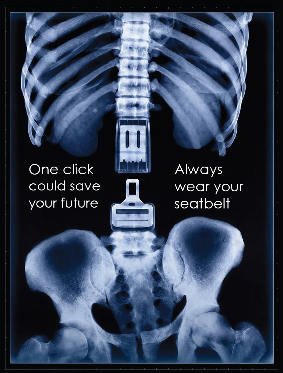
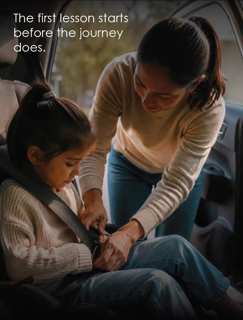
A quasi-experiment: four stimuli carrying the same road-safety message, differing in emotional framing. Created for the study, not existing commercial ads.
Participants
36, mostly students and young adults who use digital platforms daily.
Procedure
Each person saw all four in random order, to avoid sequencing bias, and answered after each one.
  1. Immediate response How much did you like it? How much did it affect you? Did it feel credible?
  2. Interpretation What is the main message?
  3. Delayed recall Which message do you remember best?
  4. Response time How long each answer took — quick answers read as intuitive, slow ones as deliberate.
  1. X-ray of a spine and ribcage: “One click could save your future. Always wear your seatbelt.”
    STIMULUS 01

    Low · informational

    Fact-led, little emotional appeal.

  2. A mother buckles her daughter into a car seat: “The first lesson starts before the journey does.”
    STIMULUS 02

    Medium · narrative

    A story that builds empathy, without extreme imagery.

  3. A teddy bear on wet tarmac beside a crashed car: “Some passengers never make it home. Wear your seatbelt.”
    STIMULUS 03

    High · emotional

    Charged imagery and cinematography.

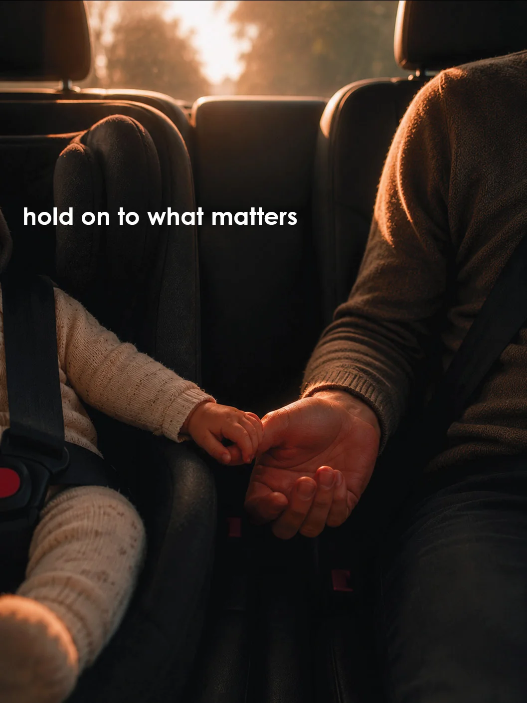
  4. Two hands held in the back seat of a car: “hold on to what matters”
    STIMULUS 04

    Ambiguous · emotion-heavy, message-light

    Moving, but unclear about what it asks.

Measured preference (share choosing each ad as their favourite) · trust and impact (ratings) · accuracy (share stating the core message correctly) · response time · plus the words people used and the gap between how clear an ad felt and what they actually understood.

05The findings · what 36 people did

Correct recall of the message
  1. Low emotion · informational66%
  2. Medium · narrative49%
  3. High · emotional32%

Accurate understanding fell as emotional content rose.

Preferred ad

~70% preferred the higher-emotion ad

~11% liked the informational one

Trust

25–30% more trustworthy

Emotionally intense ads were rated more trustworthy on average than informational versions — with nothing added that clarified their purpose.

Time to respond
2.3 semotionally charged
4.1 sinformational

Faster answers suggest less deliberation.

The ambiguous ad

~58% found it very clear or believable

44% couldn’t explain what it was saying

Result

Across 36 participants, higher emotion went with stronger preference, more trust and faster responses — and with lower accuracy about the message.

Interpretation

Emotional presentation strongly influenced preference, credibility and engagement even as factual understanding declined. People still think — but, with media built for instant consumption, they tend to respond to feeling first.

Limitations

A small sample, so no generalisation. One viewing only — real feeds repeat and adapt over time, which a static study can’t reproduce. Interpretation varies with experience and culture, and stimuli differ in more than emotion alone. A pattern, not a law.

06The design concept · Converse

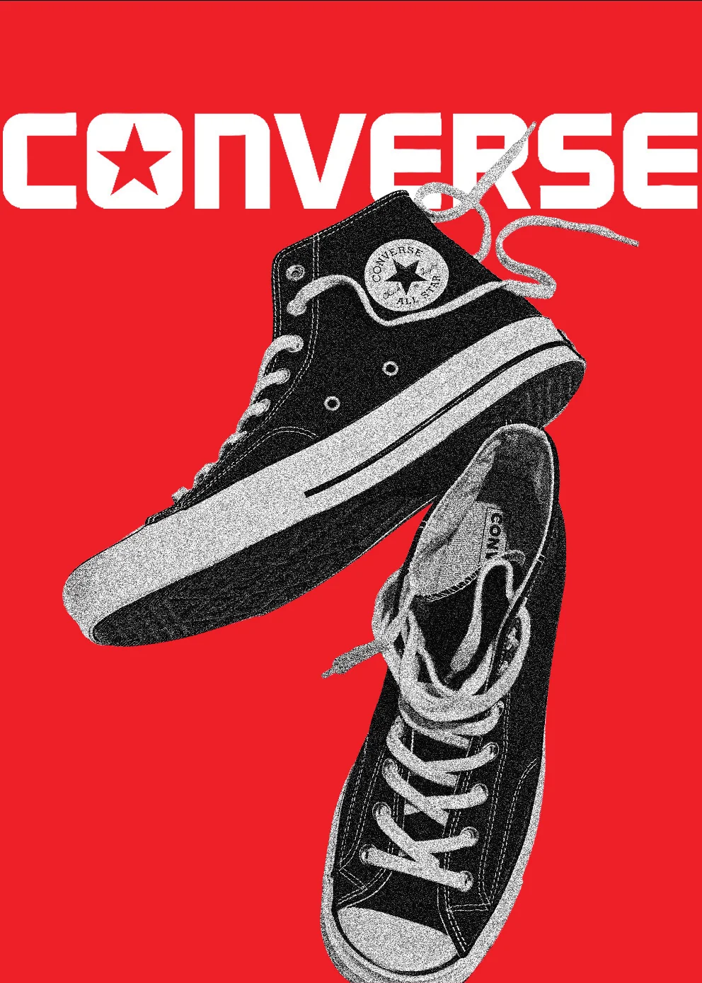
If emotion can shape what people prefer, trust and remember, can that mechanism be designed — and then revealed? The thesis answers with a Converse campaign that sells belonging before it sells a shoe.

Converse poster: two worn high-tops over the red CONVERSE wordmark

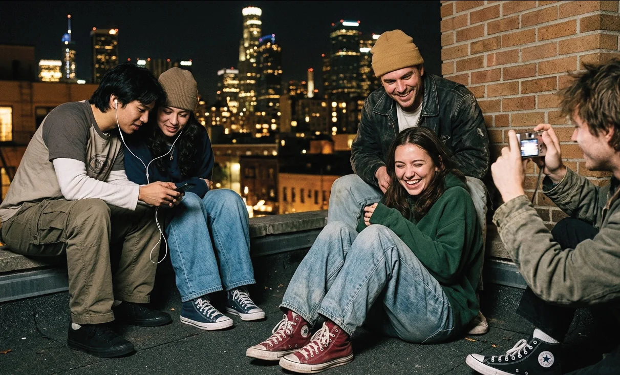
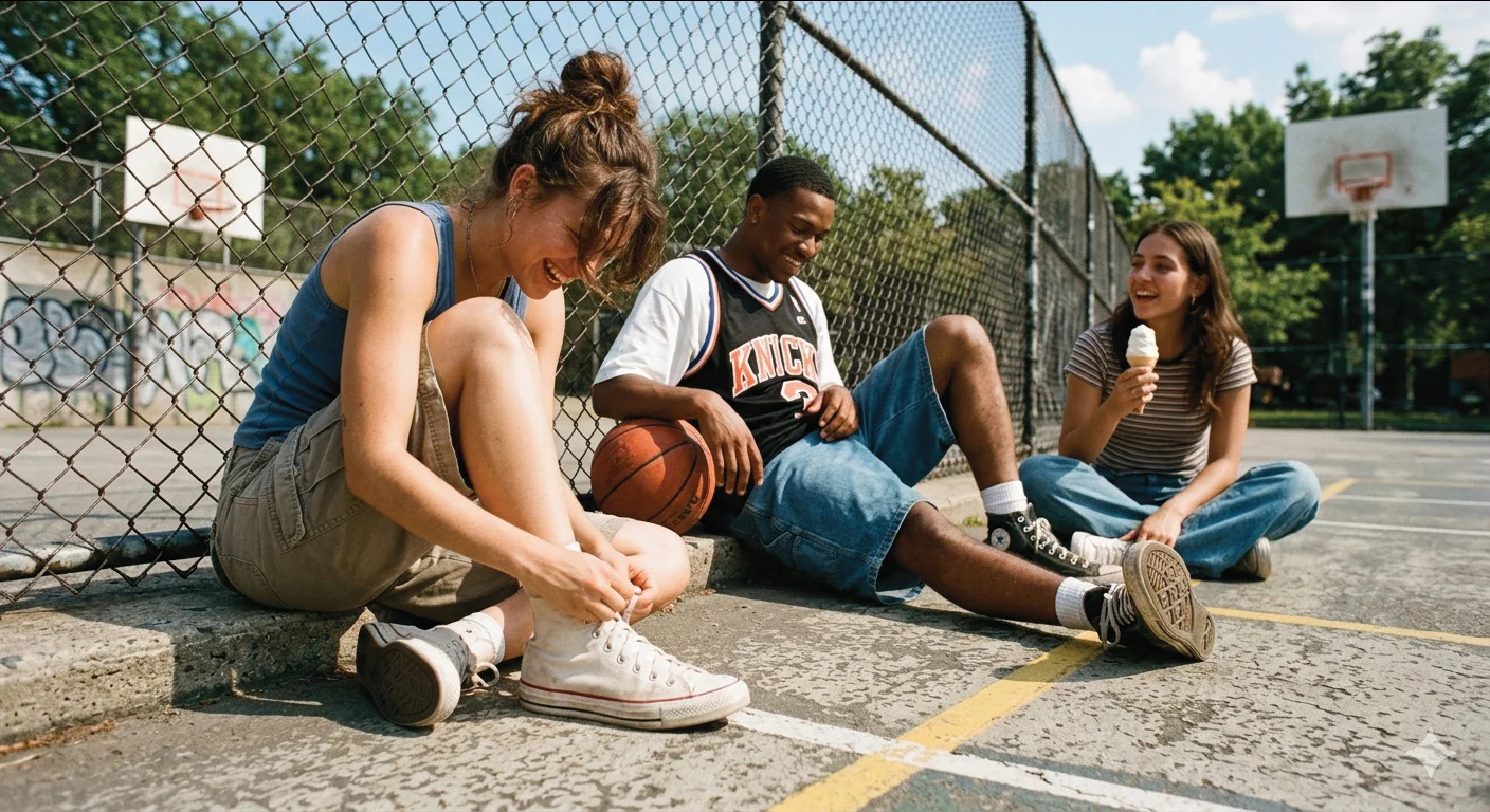
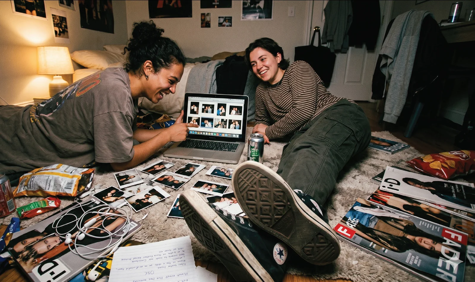
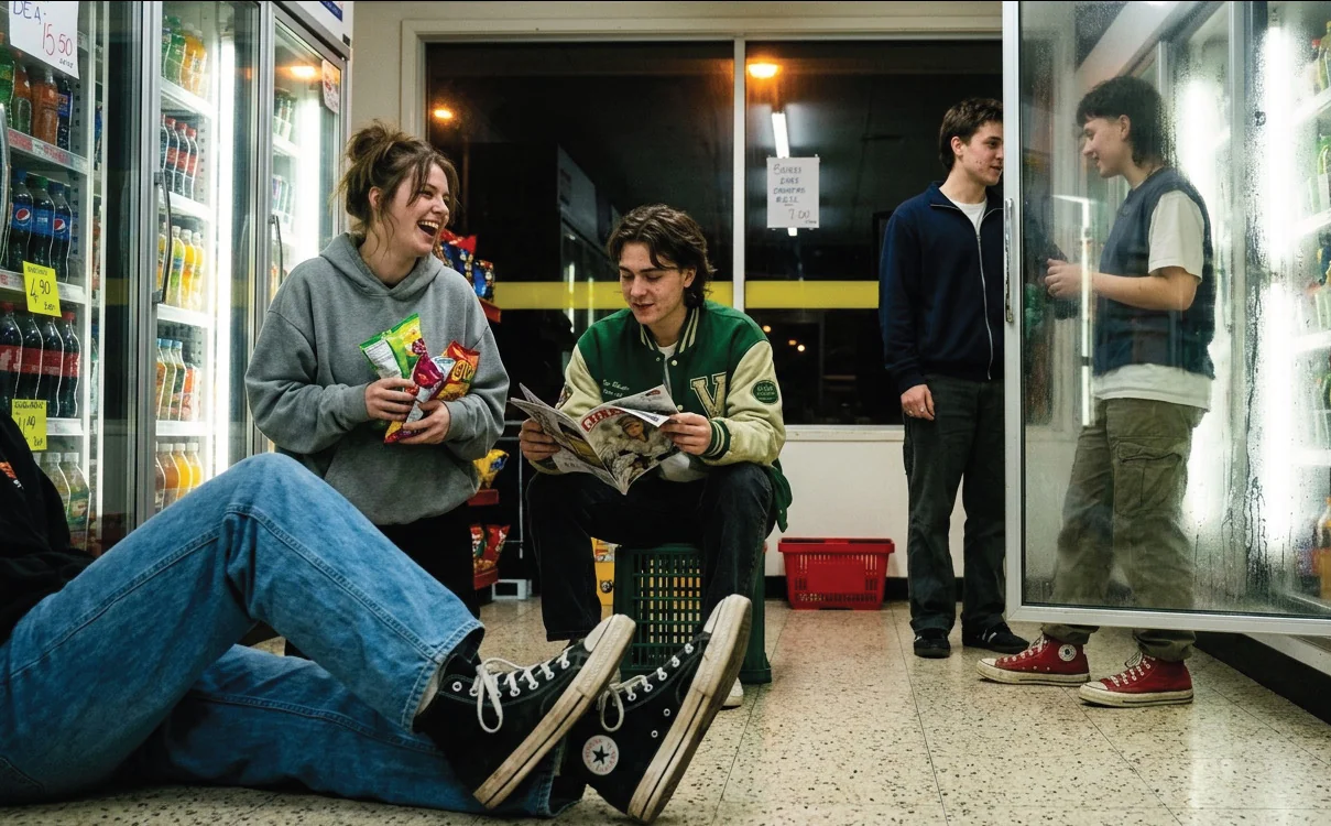
Belonging before understanding. The need to belong is one of the strongest human motivations, especially in adolescence and early adulthood. The campaign shows close, warm moments between friends — always from just outside. The product stays small; the feeling is the message.

Baumeister & Leary (1995)

  • Warm light
  • Shallow depth of field
  • Intimate framing
  • Touch, eye contact, overlap
  • The product minimised
Friends on a rooftop at night, laughing over a phone
Friends on a sofa looking at a phone together
Friends in a car, one taking a photo
Friends on a basketball court
Friends on a floor covered in printed photos
Friends sitting in a convenience-store aisle

You are watching. You are not invited.

Revealing the mechanism

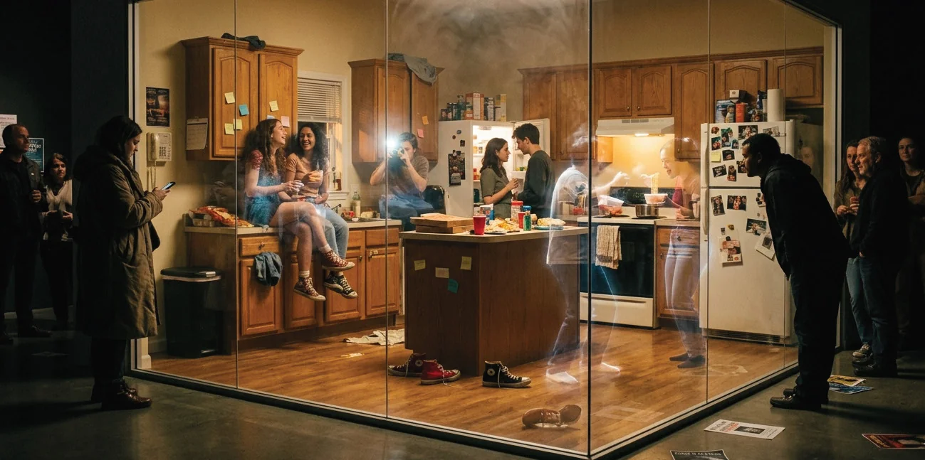
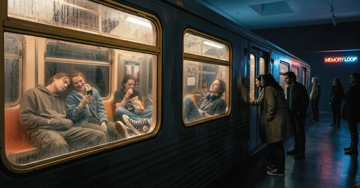
In its final executions the campaign stops pulling the viewer in and holds them outside — so the engineering of belonging becomes visible. Three installations put intimacy on display behind a barrier:

  1. A glass box in a public space
  2. A large-scale billboard that plays scenes of closeness
  3. A subway car of strangers’ intimate moments
A glass-walled room installed in a city street, a party visible inside
INSTALLATION · glass box
A lit roadside box displaying friends in a car at night
INSTALLATION · billboard
A subway carriage with friends asleep on each other, watched from the platform
INSTALLATION · subway car
  1. DiscoveryHero campaign film
  2. Emotional connectionSocial media & outdoor posters
  3. CuriosityQR code & campaign website
  4. ImmersionMemory Rooms installation
  5. ParticipationDisposable camera booths
  6. Shared memoriesUser-generated content
  7. Brand associationConverse becomes part of the memory

07Conclusion · uncertainty

So… did emotion win?

Partly. Emotional presentation steered preference, trust and engagement even when understanding fell. The data do not show that people stop thinking — only that, in media built for speed, feeling tends to answer first.

What changed

Emotional persuasion is old. What is new is the scale, the precision and the invisibility with which digital systems now apply it.

Designing responsibly

Not less emotion — more transparency. Long-term trust over short-term manipulation; experiences that support informed decisions while still moving people.

This page did it too

  • Choice — the word, or choose and chose — appeared many times before this line. Repetition.
  • Red was saved for two moments: the first flash of feeling, and Converse. Association.
  • The clearest type carried the claims; the blurred type carried the doubts. Fluency.
  • In section 02, Option B was bigger, brighter and labelled recommended. Architecture.

So — how much of what you just read did you choose to believe?